Found a total of 10000 related content
How to create a simple CSS animation with @keyframes?
Article Introduction:Use @keyframes in CSS to achieve custom animation effects. The basic steps are: 1. Define @keyframes animation, specify the animation name and keyframe style; 2. Bind the animation to the target element through the animation attribute, and set parameters such as duration, easing function, and playback times; 3. Pay attention to consistent naming, use from/to reasonably to replace 0%/100%, add browser prefixes, optimize performance, and test performance on different devices, and realize common animation effects such as button hover and load indicator.
2025-07-20
comment 0
995

Create circular progress bar animation effect using CSS3 and SVG
Article Introduction:You can use CSS3 and SVG to create a circular progress bar animation effect. The steps are as follows: Create an SVG element and define a circular path; set a dotted line style for the circular path; use CSS3 animation to control the offset of the dashed line; set a progress percentage by adjusting the initial offset of the dashed line.
2025-04-04
comment 0
750
Styling forms and form elements with css
Article Introduction:To make the form more beautiful and improve the user experience, you can optimize it from the following four points: 1. Unify the basic style of the input box and add: focus effect; 2. Hide native check boxes and radio buttons and replace them with custom icons; 3. Set hover, active status and animation for the submission button; 4. Keep the form layout neatly and aligned, and use .form-group to uniform spacing.
2025-07-10
comment 0
562
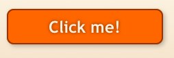
Shadow Boxing: Image-free, CSS3, Glossy Buttons
Article Introduction:CSS3 button style: Use box-shadow to create cool button effects
This article discusses two ways to create buttons using CSS3: CSS3 gradient and box-shadow. Although CSS3 gradients are becoming more and more popular in button styles, are easy to configure and can scale with button areas, their browser support is limited (mainly Firefox, Chrome, and Safari), and the syntax is inconsistent among different browsers.
By contrast, overlaying color layers with the box-shadow attribute, just like a painter overlaying pigment, can create picture-free, zoomable, fully configurable smooth buttons. Although this method may seem more complicated to layer the box-shadow color at first glance, it has more flexibility
2025-03-07
comment 0
976
How can you pause and resume a CSS animation?
Article Introduction:To pause and restore CSS animation, the most direct way is to dynamically switch the animation-play-state attribute using JavaScript. Controlling this property through JavaScript allows pause and playback to be achieved without restarting the painting. The specific steps include: 1. Add an event listener (such as button click); 2. Check the current animation status; 3. Dynamic switching status. In addition, if you only need to pause the animation during hover, you can implement it through the :hover pseudo-class combined with @keyframes, but this method is suitable for simple interactions and is not suitable for complex logic. For multiple animations or more complex scenes, you can process animations by index, reset animation state or manage states with CSS variables, and pay attention to performance
2025-06-30
comment 0
686
How to style forms using CSS?
Article Introduction:To beautify a form, you need to start from three aspects: basic style, button style and layout responsiveness. First, add basic styles such as padding, border, rounded corners, font adjustments, etc. to the input box; secondly, design the background color, hover state and disable style of the button; finally, control the form structure through flex or grid layout, set the label alignment and adapt to the mobile screen, thereby improving the overall aesthetics and user experience.
2025-07-22
comment 0
958
How to use the :hover pseudo-class in CSS?
Article Introduction:The :hover pseudo-class is used to realize style changes when mouse hovering. It is suitable for various elements such as buttons, menus, pictures, etc. The basic writing method is to add :hover after selectors, such as button:hover{background color change}. Common uses include button interaction, drop-down menus, picture enlargement, prompt display, etc. When using it, you need to note that the mobile hover may only trigger when clicked. The structure nesting may cause style failure. The z-index level, style coverage and debug with developer tools. At the same time, pay attention to compatibility and performance to avoid excessive animations affecting the experience.
2025-07-17
comment 0
300
What is a CSS animation defined with @keyframes?
Article Introduction:@keyframes is used in CSS to create keyframe animations, allowing developers to define the styles of elements at different stages of the animation. 1. Specify the style of each stage of the animation through percentage or from/to, such as 0%, 50%, and 100% respectively representing the start, middle and end states respectively; 2. Use the animation attribute to apply the defined keyframe animation to elements, including setting the animation name, duration, speed function, delay and number of playbacks, etc.; 3. Commonly used to implement complex custom animation effects, such as loading indicators, hover effects, UI feedback and background animation; 4. Notes include ensuring that the start and end frames are included, avoiding layout jitter caused by animation, testing browser compatibility, and using animation
2025-06-22
comment 0
654

What is the H5 programming language?
Article Introduction:H5 is not a standalone programming language, but a collection of HTML5, CSS3 and JavaScript for building modern web applications. 1. HTML5 defines the web page structure and content, and provides new tags and APIs. 2. CSS3 controls style and layout, and introduces new features such as animation. 3. JavaScript implements dynamic interaction and enhances functions through DOM operations and asynchronous requests.
2025-04-03
comment 0
866

10 jQuery Flip Effect Plugins
Article Introduction:Ten excellent jQuery flip effects plugins allow your HTML content and images to achieve 360-degree flip animation effects, using the transform and rotate attributes of jQuery and CSS3. These plugins are perfect for displaying your portfolio, come and try it out!
Related recommendations:
15 amazing jQuery animation design plugins
10 Very Attractive JQuery Widgets
Paid Products – Responsive page turn book based on jQuery
Completely based on HTML and jQuery, no Flash player required. Supports desktop and mobile devices!
Portfolio flip slider based on jQuery and CSS3
Click the paging button to trigger the slider to flip, each time
2025-02-25
comment 0
1245

Enhancing UI State Styling with CSS Pseudo-classes (e.g., :hover, :active)
Article Introduction:CSS pseudo-class can enhance the interaction of web pages. 1. Button interaction: Use :hover and :active to achieve hover color change and click feedback. 2. Distinguishing link status: combine: link, visited,:hover,:focus, and:active to provide visual prompts. 3. Form control: Highlight the input box through:focus, and use:invalid and:valid to verify the status. 4. Notes: Use transition animations in moderation to keep them natural, pay attention to the problem of mobile:hover failure, keep the style of the entire site consistent, and ensure that keyboard users are accessible. Rational use of these pseudo-categories can significantly improve the user experience.
2025-07-08
comment 0
468
Using CSS transform properties for visual effects
Article Introduction:The CSStransform property implements the translation, rotation and scaling effects of elements through functions such as translate, rotate, scale. 1. Translate is used for smooth movement, such as button hover displacement; 2. Rotate implements rotation animation, suitable for loading icons; 3. Scale produces scaling feedback, such as image hovering; 4. Multiple functions can be used in combination to enhance visual effects without affecting layout and improve interactive experience.
2025-07-10
comment 0
394
Creating dynamic CSS Animations using keyframes and transitions
Article Introduction:Keyframes are used for complex animations, and Transitions are used for state transitions. 1. Keyframes can define multi-stage animations, such as loading rotation effect, defined by @keyframes and applied with animation. 2. Transitions implements smooth changes in attributes, such as hover gradient color, which is controlled through transition attributes. 3. The two can be used in combination, such as button clicks to enlarge or bounce the effect to improve the naturalness of the interaction.
2025-07-14
comment 0
859
