Found a total of 10000 related content
How to create a parallax scrolling effect CSS tutorial
Article Introduction:The key to making parallax scrolling effect is to allow elements of different layers to scroll at different speeds. 1. First, build a multi-layer HTML structure, including background, medium scene and foreground, and use CSS to set the container overflow:hidden and absolute positioning; 2. Then listen to scroll events through JavaScript, use transform:translateY() to dynamically adjust the positions of each layer. The background layer scrolls slowly and the medium scene is slightly faster; 3. Finally, optimize performance, use throttling functions to control the scrolling frequency, compress image resources and adapt to the mobile terminal, and consider pure CSS solutions to improve compatibility.
2025-07-04
comment 0
820

How to make a parallax scrolling effect with HTML5?
Article Introduction:To realize the parallax scrolling effect in HTML5, you need to combine HTML, CSS and JavaScript. The core is to allow different page elements to scroll at different speeds. 1. The HTML structure should contain multiple independent layers, such as using different class names to represent background, intermediate content and foreground. 2. CSS uses position:absolute and translateZ to create a 3D depth sense. The smaller the value of the background layer, the slower the scrolling. 3. JavaScript can listen to scroll events, dynamically adjust the translateY value, and control the scroll speed of each layer by multiplying by a coefficient. 4. Pay attention to performance optimization and use requestAnimationFrame
2025-07-15
comment 0
722
Implementing parallax scrolling effects with css
Article Introduction:The parallax scrolling effect can be achieved through CSS, and the core is to make the background and content scrolling speed different. Specific methods: 1. Use background-attachment:fixed to achieve basic parallax; 2. Use a hierarchical structure to control the scrolling speed of each layer through background-position and JavaScript; 3. Pay attention to performance optimization, mobile adaptation and reasonable use of hierarchical effects to improve the experience.
2025-07-14
comment 0
521
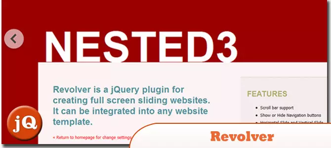
12 jQuery Fullscreen Plugins
Article Introduction:12 amazing jQuery full screen plug-ins to create a fascinating website!
Sometimes, full-screen websites are really cool! If a website looks plain, how long do you think visitors will stay? So, we have prepared some good stuff to help you: 12 jQuery full-screen plugins that give your website a stunning full-screen responsive effect! These plugins will add extraordinary visuals to your website. Ready?
Related recommendations:
100 jQuery picture/content slider plug-ins
30 jQuery responsive layout plug-ins
Revolver
A jQuery plugin for creating full-screen sliding websites. It can be integrated into any website template.
Source code
2025-02-25
comment 0
558


The `allowfullscreen` Attribute for Iframes
Article Introduction:The allowfullscreen property is used for labels, allowing embedded content to be displayed in full screen. Common writing methods include allowfullscreen, allow="fullscreen" and allow="fullscreen;autoplay;encrypted-media", etc. It is recommended to use the standard writing method allow="fullscreen". If the full screen function does not take effect, it may be due to browser restrictions, parent page permission settings, or the content itself does not support it. In addition, you can finely control permissions through the allow attribute, such as allow="full
2025-07-17
comment 0
921

A shortcut: How to take a scrolling screenshot of full webpage
Article Introduction:Mac screenshots and scrolling guide: Easily capture web pages and scrolling content
Screenshots and sharing images on macOS devices are very simple, but when taking an entire web page or scrolling content, screenshots are often limited to the visible area of ??the screen. What if you need to intercept more content?
This article will introduce two convenient and fast methods to help you take screenshots of complete web pages and scroll content on your Mac. Once you subscribe to Setapp, you can use both methods for free and choose the one that works best for you. Learn how to capture web pages in full, print, copy to clipboard, add comments, and share easily.
Scroll screenshot
Capture full chat history, reports, or any scrollable content from a website or application.
Free trial complete screenshot of web pages, more
2025-04-15
comment 0
883
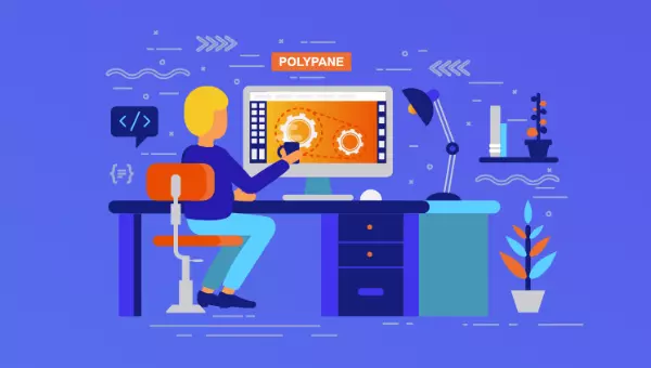
Meet Polypane, a Browser That Makes You Five Times Faster
Article Introduction:Polypane: A multi-screen browser specially designed for efficient web development
Core advantages:
Multi-screen synchronous view: Polypane subverts tradition and uses multi-screen views to simultaneously show the website's effect under different screen sizes, significantly improving the efficiency of responsive design.
Integrated development tools: Built-in powerful development tools, including real-time reloading, CSS debugging, barrier-free testing, full-screen screenshots, device simulation, etc., simplifying the development process and improving productivity.
Significantly improve efficiency: Research shows that developers using Polypane are 3 to 10 times more efficient, and significantly reduce the workload of bug fixes after going online.
As developers, we pursue efficient tools. We carefully select keyboards and code editors
2025-02-14
comment 0
1120

What is the difference between cat, tac, and less?
Article Introduction:cat is used to quickly view or merge file contents, and tac starts to display files in reverse order from the end, which is less suitable for browsing large files on pages. cat is suitable for small file viewing, file merging or redirecting output; tac is suitable for scenarios where files need to be read in reverse order, such as log analysis; less supports scrolling, searching and screen-by-screen viewing, which is suitable for processing large files. The three are often used in combination with pipelines to give full play to their respective advantages.
2025-07-17
comment 0
636

How to create a full-screen landing page with HTML and CSS?
Article Introduction:To create a full-screen landing page, you need to use HTML and CSS to combine viewport units and layout techniques. 1. Set the HTML structure and include viewport meta tags to adapt to mobile devices; 2. Use height:100vh to make the container occupy the full viewport height; 3. Use Flexbox to achieve vertical and horizontal centering of the content; 4. Use background-size:cover and background-position:center to ensure responsive display when adding background images; 5. Optimize the scrolling experience through scroll-behavior or JavaScript to ensure normal display and smooth interaction.
2025-07-07
comment 0
912
How to create a sticky header or footer using css position sticky
Article Introduction:To implement stickyheader or footer, the key is to use position:sticky correctly. When implementing stickyheader, you need to set position:sticky and top:0, and make sure that the parent container does not have overflow:hidden. It is recommended to add z-index to prevent overwriting; 1. Stickyheader does not detach from the document flow, and is fixed when scrolling to the top, and does not affect the layout of other content; 2. When implementing stickyfooter, you need to wrap the main content and set footer's position:sticky and bottom:0, but it only takes effect when the content is less than one screen; 3. When using sticky, you need to
2025-07-13
comment 0
328

Best Graphics Settings for Schedule 1
Article Introduction:"Schedule 1" runs stutter? Don't worry, you are not alone! The game is still being optimized, and even computers with good configurations may have lag. Here is a performance-optimized graphics setup guide to help you play smoothly.
More readings: "Schedule 1" operation guide
Display settings
Recommended settings
Resolution: Set to the native resolution of the monitor unless absolutely necessary.
Display mode: Exclusive full screen mode (best performance)
Vertical Synchronization (VSync): Off (reduces input latency and improves frame rate)
Interface Scaling: 45% to 50% (maintain readability to avoid over-bloated interface)
Target frame rate: 40% (At present, this setting has the most effect
2025-04-07
comment 0
546

Creating Sticky Navigation Headers or Sidebars with CSS position: sticky
Article Introduction:position:sticky The key to implementing sticky navigation bar or sidebar is to correctly set positioning properties and understand usage restrictions. 1. It must be used with top, bottom, left or right, and the parent container cannot have properties such as overflow:hidden, transform or filter; 2. When used in the navigation bar, z-index and background color must be set to ensure visibility and readability, and pay attention to the hierarchical relationship of multiple sticky elements and content occlusion issues; 3. When implementing the sidebar, you need to set the top value and height:fit-content to prevent the screen from being full, and add scrolling support if necessary; 4. Pay attention to compatibility, mainstream browsers have good support, but I
2025-07-09
comment 0
498

How does server-side rendering (SSR) or static site generation (SSG) with frameworks like Nuxt.js improve Vue application performance and SEO?
Article Introduction:SSR and SSG significantly improve the performance and SEO of Vue applications by generating full HTML at server or build time. First, SSR returns to the rendered page when the user first visits, reducing the time of blank screens and speeding up the perceived loading speed; second, SSG pre-renders the page into a static file, simplifying deployment and speeding up content rendering; third, search engines can directly crawl content and metadata in HTML to improve SEO effect; fourth, Nuxt3 supports ISR, allowing static pages to be updated on demand, taking into account performance and dynamic content needs. Together, these methods optimize home screen experience, SEO performance and deployment flexibility.
2025-06-19
comment 0
635
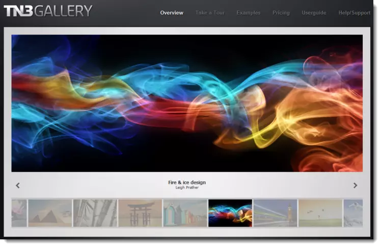
TN3 Gallery - #1 Professional Image Gallery
Article Introduction:TN3 Gallery: A powerful custom image library based on HTML5
TN3 Gallery is a new HTML5 image library developed using jQuery, which is highly customizable. I know you might be thinking: "Another picture library plugin?" But TN3 is by no means an ordinary picture library! It represents a new generation of the photo gallery, here are the reasons why you should use it as your preferred photo gallery.
TN3 Gallery demo features:
Amazing loading speed
Advanced Album View: Full Screen Mode is amazing!
Movie-level image transition effect
A wide variety of user-friendly skins to choose from
Professional look and feel
Fully customization via TN3 API
Load your gallery using XML
2025-03-03
comment 0
752


Dave The Diver: How To Catch Spider Crabs
Article Introduction:In Dave The Diver, there are some creatures that are not easy to catch. Or, catch alive that is. The spider crab is one of those very species, making it seem like the only way to bring these crustaceans back up to land is to viciously crack them up w
2025-01-10
comment 0
806

