Discover a premium button design crafted with glowing gradients, animated borders, and advanced hover effects. Perfect for web projects that need a high-quality, eye-catching element. Inspired by the gladiatorial battles of ancient Rome, this button design captures the intensity and style needed for a game like Gladiators Battle. Ideal for use in interactive games, landing pages, and user interfaces where a high-end visual experience is essential.
Tags: Gladiators Battle, premium button, CSS animations, glowing button, interactive design, UI/UX, web design, HTML/CSS, gradient animations, ancient Rome, gaming interface, gladiator game
Creating visually appealing buttons can significantly enhance a website's user experience. This tutorial walks you through building a high-quality, modern button with HTML and CSS. We'll add animations, gradients, and hover effects to make it interactive and stylish. Follow along to create a glowing button that feels premium and engaging.

Step 1: Setting Up the HTML Structure
Our button will be wrapped in a container with a glow effect. Here’s the HTML structure:
<!DOCTYPE html>
<html lang="en">
<head>
  <meta charset="UTF-8">
  <meta name="viewport" content="width=device-width, initial-scale=1.0">
  <title>Premium Button Tutorial</title>
  <link rel="stylesheet" href="styles.css">
</head>
<body>

  <div>


<p>button-container: Holds the button and glow effect.<br>
premium-btn: The button itself, which includes an animation span for additional effects.<br>
outer-glow: Adds an animated glow around the button for a high-impact visual effect.<br>
Step 2: Setting Up CSS Styles<br>
Base Styles<br>
First, we’ll define the styles for the body and button container.<br>
</p>

<pre class="brush:php;toolbar:false">body {
  display: flex;
  align-items: center;
  justify-content: center;
  min-height: 100vh;
  background-color: #1b1b2f;
  margin: 0;
  font-family: Arial, sans-serif;
  overflow: hidden;
}

.button-container {
  position: relative;
  display: inline-block;
}
These styles center the button on the screen, with a dark background color to make the glowing effects pop.
Adding the Glow Effect
The outer-glow class adds a large, colorful glow around the button. This effect is achieved with a gradient background, blur, and an animation that pulsates.
.outer-glow {
  position: absolute;
  top: -25px;
  left: -25px;
  right: -25px;
  bottom: -25px;
  border-radius: 50px;
  background: linear-gradient(135deg, #1de9b6, #6a00f4, #ff4081, #1de9b6);
  background-size: 400% 400%;
  filter: blur(50px);
  opacity: 0.8;
  animation: pulseGlow 6s ease-in-out infinite;
  pointer-events: none;
}
Button Styling
Next, let’s style the button itself. Here, we add a gradient background, a bold font, and a shadow effect for an elevated look.
.premium-btn {
  padding: 20px 50px;
  font-size: 22px;
  font-weight: bold;
  color: #fff;
  background: linear-gradient(45deg, #00c6ff, #0072ff);
  border: none;
  border-radius: 50px;
  position: relative;
  overflow: hidden;
  cursor: pointer;
  transition: all 0.4s ease;
  text-transform: uppercase;
  letter-spacing: 2px;
  box-shadow: 0px 4px 20px rgba(0, 255, 255, 0.4);
  z-index: 1;
}
Adding the Border Animation
The .border-animation span inside the button creates a colorful border that continuously rotates.
.border-animation {
  position: absolute;
  top: -5px;
  left: -5px;
  right: -5px;
  bottom: -5px;
  border-radius: 50px;
  background: linear-gradient(90deg, #1de9b6, #6a00f4, #ff4081, #1de9b6);
  background-size: 300%;
  z-index: -1;
  animation: rotateBorder 4s ease-in-out infinite;
  filter: blur(8px);
}
Hover Effects
To make the button interactive, we add hover effects that change its background gradient, increase the box shadow, and trigger a ripple effect.
.premium-btn:hover {
  background: linear-gradient(45deg, #ff4081, #1de9b6);
  color: #ffffff;
  box-shadow: 0px 6px 30px rgba(0, 255, 255, 0.6), 0px 6px 30px rgba(255, 64, 129, 0.6);
  transform: scale(1.05);
}

.premium-btn::before {
  content: '';
  position: absolute;
  top: -50%;
  left: -50%;
  width: 200%;
  height: 200%;
  background: radial-gradient(circle, rgba(255, 255, 255, 0.2), transparent 70%);
  transform: rotate(0deg);
  border-radius: 50%;
  filter: blur(50px);
  opacity: 0.9;
}

.premium-btn:hover::before {
  transform: rotate(45deg);
}
Ripple Effect
The ripple effect adds an expanding circle animation when the button is hovered over, giving a sleek, modern touch.
.premium-btn::after {
  content: '';
  position: absolute;
  top: 50%;
  left: 50%;
  width: 0;
  height: 0;
  background: rgba(255, 255, 255, 0.5);
  border-radius: 50%;
  transform: translate(-50%, -50%);
  opacity: 0;
  transition: width 0.4s ease, height 0.4s ease, opacity 0.5s ease;
}

.premium-btn:hover::after {
  width: 350%;
  height: 350%;
  opacity: 0;
}
Animations with Keyframes
Finally, we define keyframes for the glowing border rotation and pulsating background.
<!DOCTYPE html>
<html lang="en">
<head>
  <meta charset="UTF-8">
  <meta name="viewport" content="width=device-width, initial-scale=1.0">
  <title>Premium Button Tutorial</title>
  <link rel="stylesheet" href="styles.css">
</head>
<body>

  <div>


<p>button-container: Holds the button and glow effect.<br>
premium-btn: The button itself, which includes an animation span for additional effects.<br>
outer-glow: Adds an animated glow around the button for a high-impact visual effect.<br>
Step 2: Setting Up CSS Styles<br>
Base Styles<br>
First, we’ll define the styles for the body and button container.<br>
</p>

<pre class="brush:php;toolbar:false">body {
  display: flex;
  align-items: center;
  justify-content: center;
  min-height: 100vh;
  background-color: #1b1b2f;
  margin: 0;
  font-family: Arial, sans-serif;
  overflow: hidden;
}

.button-container {
  position: relative;
  display: inline-block;
}
Creating a premium-style button with HTML and CSS has been an inspiring journey in leveraging modern web design techniques to craft visually appealing and interactive components. By combining linear gradients, CSS animations, and hover effects, we've designed a button that feels dynamic and engaging—perfect for capturing user attention and enhancing website interaction.
This project demonstrates the power of CSS in creating layered effects, such as glowing outlines, rotating borders, and ripple animations, all without relying on JavaScript. This not only ensures a fast, responsive interface but also emphasizes how even subtle design choices can significantly elevate user experience.
As we continue to explore CSS and modern design trends, there are endless possibilities for further customization. Future articles in this series will dive deeper into the art of creating interactive web components, exploring advanced CSS techniques for responsive design, complex animations, and intuitive UX patterns. Whether you’re looking to enhance your personal project or professional website, mastering these styling techniques will provide you with invaluable tools for creating engaging, user-centered web interfaces.
? Discover More:
Explore Gladiators Battle: Discover an immersive strategy and combat experience at https://gladiatorsbattle.com
Check Out Our GitHub: View code examples and tutorials at https://github.com/HanGPIErr/Gladiators-Battle-Documentation
Connect on LinkedIn: Follow me on LinkedIn for updates on web design and development projects at https://www.linkedin.com/in/pierre-romain-lopez/
Follow on X: Stay updated on design and gaming projects at https://x.com/GladiatorsBT
By continuing with us, you’ll gain insights into creating beautiful, responsive designs with HTML and CSS, pushing the boundaries of web interactivity with minimal code. Join us as we explore more techniques to bring engaging, premium-quality elements to life on the web.
The above is the detailed content of How to Create a Stunning Modern Button with CSS and HTML. For more information, please follow other related articles on the PHP Chinese website!

Hot AI Tools

Undress AI Tool
Undress images for free

Undresser.AI Undress
AI-powered app for creating realistic nude photos

AI Clothes Remover
Online AI tool for removing clothes from photos.

Clothoff.io
AI clothes remover

Video Face Swap
Swap faces in any video effortlessly with our completely free AI face swap tool!

Hot Article

Hot Tools

Notepad++7.3.1
Easy-to-use and free code editor

SublimeText3 Chinese version
Chinese version, very easy to use

Zend Studio 13.0.1
Powerful PHP integrated development environment

Dreamweaver CS6
Visual web development tools

SublimeText3 Mac version
God-level code editing software (SublimeText3)

Hot Topics
 What is 'render-blocking CSS'?
Jun 24, 2025 am 12:42 AM
CSS blocks page rendering because browsers view inline and external CSS as key resources by default, especially with imported stylesheets, header large amounts of inline CSS, and unoptimized media query styles. 1. Extract critical CSS and embed it into HTML; 2. Delay loading non-critical CSS through JavaScript; 3. Use media attributes to optimize loading such as print styles; 4. Compress and merge CSS to reduce requests. It is recommended to use tools to extract key CSS, combine rel="preload" asynchronous loading, and use media delayed loading reasonably to avoid excessive splitting and complex script control.
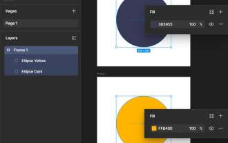 How to use Lotties in Figma
Jun 14, 2025 am 10:17 AM
In the following tutorial, I will show you how to create Lottie animations in Figma. We'll use two colorful designs to exmplify how you can animate in Figma, and then I'll show you how to go from Figma to Lottie animations. All you need is a free Fig
 Breaking Boundaries: Building a Tangram Puzzle With (S)CSS
Jun 13, 2025 am 11:33 AM
We put it to the test and it turns out Sass can replace JavaScript, at least when it comes to low-level logic and puzzle behavior. With nothing but maps, mixins, functions, and a whole lot of math, we managed to bring our Tangram puzzle to life, no J
 External vs. Internal CSS: What's the Best Approach?
Jun 20, 2025 am 12:45 AM
ThebestapproachforCSSdependsontheproject'sspecificneeds.Forlargerprojects,externalCSSisbetterduetomaintainabilityandreusability;forsmallerprojectsorsingle-pageapplications,internalCSSmightbemoresuitable.It'scrucialtobalanceprojectsize,performanceneed
 Does my CSS must be on lower case?
Jun 19, 2025 am 12:29 AM
No,CSSdoesnothavetobeinlowercase.However,usinglowercaseisrecommendedfor:1)Consistencyandreadability,2)Avoidingerrorsinrelatedtechnologies,3)Potentialperformancebenefits,and4)Improvedcollaborationwithinteams.
 CSS Case Sensitivity: Understanding What Matters
Jun 20, 2025 am 12:09 AM
CSSismostlycase-insensitive,butURLsandfontfamilynamesarecase-sensitive.1)Propertiesandvalueslikecolor:red;arenotcase-sensitive.2)URLsmustmatchtheserver'scase,e.g.,/images/Logo.png.3)Fontfamilynameslike'OpenSans'mustbeexact.
 CSS Counters: A Step-by-Step Tutorial with Examples
Jun 12, 2025 am 10:31 AM
CSSCounters is a tool for creating automatic numbers. 1. Basic usage: define and operate counters through counter-reset and counter-increment, such as "SectionX." before h2. 2. Advanced usage: Use nested counters to create complex numbers, such as chapter and section numbers. 3. Notes: Ensure the counter is reset correctly, optimize performance, and simplify counter logic. 4. Best practice: clear naming, define counters in CSS, and use counter-increment and counter-reset reasonably.
 What is Autoprefixer and how does it work?
Jul 02, 2025 am 01:15 AM
Autoprefixer is a tool that automatically adds vendor prefixes to CSS attributes based on the target browser scope. 1. It solves the problem of manually maintaining prefixes with errors; 2. Work through the PostCSS plug-in form, parse CSS, analyze attributes that need to be prefixed, and generate code according to configuration; 3. The usage steps include installing plug-ins, setting browserslist, and enabling them in the build process; 4. Notes include not manually adding prefixes, keeping configuration updates, prefixes not all attributes, and it is recommended to use them with the preprocessor.


