Found a total of 10000 related content
How to achieve animation effects (such as 3D transformation, transition animation) through CSS?
Article Introduction:CSS can achieve animation effects through transition and animation properties. The specific steps are as follows: 1. Use transition properties to achieve simple transition effects, such as getting bigger and changing colors when the button is hovered. 2. Use transform and perspective properties to implement 3D transformation, such as creating and rotating cubes. 3. Optimize animation performance. It is recommended to use the will-change attribute to reduce animation complexity and use requestAnimationFrame to control the frame rate.
2025-05-20
comment 0
840
10 Magicial jQuery Text Effect Plugins
Article Introduction:10 magical jQuery text special effects plugins to make your website stand out! jQuery is not only used for menus and animation effects. With jQuery, you can also create attractive text effects and cleverly use text to communicate effectively with users. Through this collection, you can create text gradients, text fly-in effects, text glows, and more. Enjoy it!
Codename Rainbows
We use some JavaScript and CSS magic to apply a two-color gradient for any text. Shadows and highlights can also be applied. This is especially effective in large websites or dynamic content, as it is impractical to create images for each instance in these cases.
source
jQuer
2025-03-07
comment 0
1150
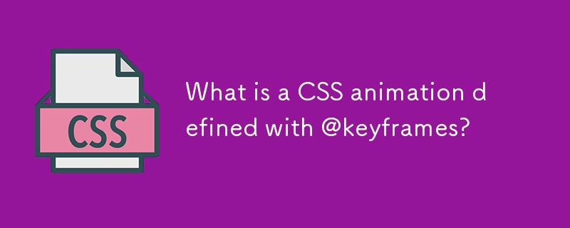
What is a CSS animation defined with @keyframes?
Article Introduction:@keyframes is used in CSS to create keyframe animations, allowing developers to define the styles of elements at different stages of the animation. 1. Specify the style of each stage of the animation through percentage or from/to, such as 0%, 50%, and 100% respectively representing the start, middle and end states respectively; 2. Use the animation attribute to apply the defined keyframe animation to elements, including setting the animation name, duration, speed function, delay and number of playbacks, etc.; 3. Commonly used to implement complex custom animation effects, such as loading indicators, hover effects, UI feedback and background animation; 4. Notes include ensuring that the start and end frames are included, avoiding layout jitter caused by animation, testing browser compatibility, and using animation
2025-06-22
comment 0
652
Inspirational UI Design Ideas for Your Next Website Project
Article Introduction:Design Points
This article discusses how to cleverly use micro-interaction, hover animation, CSS gradient and conversion effects in website design to enhance visual appeal, guide user behavior, and ultimately bring better user experience.
Micro-interaction, hover animation, CSS gradients and transformations: These elements can effectively enhance visual interest and guide users to complete specific operations.
Gradient Background and CSS Transformation: As shown in the Stripe website, gradient background and CSS Transformation can create compelling titles or backgrounds for call-to-action elements.
Interactive Menu: An interactive menu with unique layouts, styling icons, titles, and summary descriptions that transform a normal menu into a engaging display area.
Subtle repeat animation: No user interaction required
2025-02-17
comment 0
703
How can you pause and resume a CSS animation?
Article Introduction:To pause and restore CSS animation, the most direct way is to dynamically switch the animation-play-state attribute using JavaScript. Controlling this property through JavaScript allows pause and playback to be achieved without restarting the painting. The specific steps include: 1. Add an event listener (such as button click); 2. Check the current animation status; 3. Dynamic switching status. In addition, if you only need to pause the animation during hover, you can implement it through the :hover pseudo-class combined with @keyframes, but this method is suitable for simple interactions and is not suitable for complex logic. For multiple animations or more complex scenes, you can process animations by index, reset animation state or manage states with CSS variables, and pay attention to performance
2025-06-30
comment 0
681
Advanced CSS hover effects tutorial
Article Introduction:The hover effect of CSS can enhance the interactive texture through various techniques. 1. Use transition to achieve smooth animation, control the process of color, size and position change, and enhance the sense of nature; 2. Use pseudo-elements (::before or ::after) to create mask or scan effects to enrich visual feedback; 3. Combine transform and filter to achieve dynamic effects such as image enlargement, contrast changes and shadows; 4. Pay attention to mobile compatibility issues, avoid relying on hover to display key information, and consider JavaScript or alternative interaction solutions.
2025-07-07
comment 0
979

10 Simple CSS and JavaScript Micro-interactions for Buttons
Article Introduction:Web button micro-interaction design: Ten tips to improve user experience
This article will introduce ten simple ways to add micro-interactions to web buttons to enhance user experience and make the website more attractive.
Core points:
Enhanced user experience: Microinteraction provides instant feedback, improve user participation, and improve overall user experience.
Multiple effects: The tutorial covers a variety of effects such as sound, border animation, 3D transformation, and more complex interactions such as shape and text changes.
Accessibility and Interaction: Sound-based micro-interactions are especially useful for improving accessibility, especially on mobile devices.
Use of CSS and JavaScript: All effects are dynamically interspersed through CSS styles and animations and JavaScript
2025-02-08
comment 0
1023
An Introduction to jQuery Scroll-based Animations
Article Introduction:Core points
Scroll-based animations and special effects are a technology that allows web developers to create dynamic interactive web experiences. They are triggered when the user scrolls down the page and can be manipulated and implemented with CSS and jQuery.
To create responsive scroll-based effects, you must define the width and height properties of the browser window. Without these properties, the effects will not work properly when the user resizes the window.
This tutorial provides four scroll-based animations and effects examples that demonstrate how they vary based on the value of the window width attribute. These examples include animation of opacity, height, width, left, right, and bottom properties of various elements.
This tutorial also contains a FAQ section that provides solutions to FAQ
2025-02-21
comment 0
1035
What is the difference between a CSS transition and a CSS animation?
Article Introduction:CSS transitions are suitable for simple state changes, while CSS animations are used for complex effects. 1. The transition only supports start and end states, which are suitable for simple interactions such as button hovering; 2. The animation provides complete control through keyframes, suitable for scenes with looping playback or precise timing; 3. Both should be given priority to use opacity and transform attributes for best performance; 4. It should be selected according to needs to avoid unnecessary animations distracting users.
2025-06-24
comment 0
472

What are CSS transitions
Article Introduction:CSS transitions enable switching between CSS attribute values ??through smooth animations, which are suitable for user interaction scenarios such as button hovering effects, menu expansion and collapse. Common usages include button closure effect, drop-down menu gradient, background color gradient, image transparency or zoom changes. The basic syntax is a transition: attribute duration time sequence function, which can specify a single or multiple attributes, or all can be used to represent all attributes, but it should be used with caution. Timing functions such as ease, linear, and ease-in-out control the animation speed curve, and can also be customized by cubic-bezier. It is recommended to prioritize opacity and transform for better performance, combined with @media(prefers-
2025-07-01
comment 0
294
Creating tooltips with pure CSS
Article Introduction:The method of implementing tooltip with pure CSS is: 1. Use nested HTML structure to wrap the trigger area and prompt content; 2. Control the display and hide of child elements through:hover; 3. Use absolute positioning to set the prompt box position; 4. Add animation to improve the experience; 5. Pay attention to z-index and multi-directional adaptation. The specific implementation includes setting .tooltip as relative positioning, .tooltiptext is hidden by default, becomes visible when hover, and can add transition to achieve fading and delay effects. At the same time, positioning in different directions is controlled through class names, but it should be noted that the effect of hover on the mobile side may be limited.
2025-07-07
comment 0
206

Implementing Clickable Buttons Using the HTML button Element
Article Introduction:To use HTML button elements to achieve clickable buttons, you must first master its basic usage and common precautions. 1. Create buttons with tags and define behaviors through type attributes (such as button, submit, reset), which is submitted by default; 2. Add interactive functions through JavaScript, which can be written inline or bind event listeners through ID to improve maintenance; 3. Use CSS to customize styles, including background color, border, rounded corners and hover/active status effects to enhance user experience; 4. Pay attention to common problems: make sure that the disabled attribute is not enabled, JS events are correctly bound, layout occlusion, and use the help of developer tools to troubleshoot exceptions. Master this
2025-07-07
comment 0
626
Creating custom shapes with css clip-path
Article Introduction:Use the clip-path attribute of CSS to crop elements into custom shapes, such as triangles, circular notches, polygons, etc., without relying on pictures or SVGs. Its advantages include: 1. Supports a variety of basic shapes such as circle, ellipse, polygon, etc.; 2. Responsive adjustment and adaptable to mobile terminals; 3. Easy to animation, and can be combined with hover or JavaScript to achieve dynamic effects; 4. It does not affect the layout flow, and only crops the display area. Common usages are such as circular clip-path:circle (50pxatcenter) and triangle clip-path:polygon (50%0%, 100 0%, 0 0%). Notice
2025-07-09
comment 0
186

How does the ::before and ::after pseudo-elements allow for styling non-DOM content?
Article Introduction:CSS pseudo-elements::before and ::after allow insertion and styling of non-DOM content without modifying HTML. By setting content attributes, you can add decorative text or symbols before and after the content of the element, and apply styles such as fonts, backgrounds, positioning and even animations, such as adding colored "Note:" tags or button hover animations. Common uses include dynamic icons, prompt tags, form tags and UI effects. However, it should be noted that if the content is not set, the pseudo-element is invalid; it cannot interact through JavaScript; and does not support nested HTML structures.
2025-06-08
comment 0
368


Dave The Diver: How To Catch Spider Crabs
Article Introduction:In Dave The Diver, there are some creatures that are not easy to catch. Or, catch alive that is. The spider crab is one of those very species, making it seem like the only way to bring these crustaceans back up to land is to viciously crack them up w
2025-01-10
comment 0
776

