Found a total of 10000 related content

In how many ways you can display HTML elements?
Article Introduction:Article discusses various HTML element display methods via CSS, including block, inline, flexbox, and grid, impacting web layout and user experience.
2025-04-30
comment 0
548

Layout Secret Weapon #1: The CSS Table Property
Article Introduction:CSS display: table attribute: a tool to solve layout problems
Core points:
CSS's table attribute is powerful, can solve multiple layout problems and is compatible with all modern browsers. It allows HTML elements to function like table elements, providing a common solution to complex layout and alignment problems.
The CSS table attribute can be used to create contour boxes, simple old-style layouts, and adaptive layouts with content orchestration. It is especially useful in responsive designs, allowing elements to resize and position according to the user's screen size.
Although the CSS table attribute has many advantages, it also has some limitations. Compared to other display properties, it is creating a
2025-02-20
comment 0
768

What is HTML? Explain its purpose and structure.
Article Introduction:HTML structures web content for browser display, using tags like <html>, <head>, <body>. Essential for webpage layout, it differs from CSS (styling) and JavaScript (interactivity).
2025-03-19
comment 0
329

Structuring data with the HTML ``, ``, `` description list.
Article Introduction:Using HTML, and tags can clearly and semantically display terms and their definitions, product features, or key-value pairs. 1. It is suitable for scenarios such as vocabulary, metadata (such as file details), FAQs and product specifications; 2. A structure wraps multiple (terms) and (description), which can support multiple interpretations of one term; 3. When using correctly, avoid wrapping each group of items in their own separate areas, nor should they nest titles or paragraphs in them; 4. Styles can be added through CSS to improve readability, such as setting spacing, indentation, bold fonts or using flex/grid layout. This structure is not only concise and clear, but also improves the accessibility and SEO effect of the web page.
2025-07-03
comment 0
353

How to create a simple popup or modal with HTML, CSS, and JS?
Article Introduction:To achieve a basic pop-up effect, you need to follow the following steps: 1. Structure: Use HTML to create trigger buttons, mask layer and pop-up content area; 2. Style: Set default hidden, centered layout, mask background and close button styles through CSS; 3. Interaction: Use JavaScript to bind click events to control pop-up display and hide, and can expand the ESC key closing function; 4. Optimization: Add CSS animation to improve user experience. The entire process does not require a third-party library, which is suitable for quickly realizing basic pop-up functions.
2025-07-12
comment 0
368
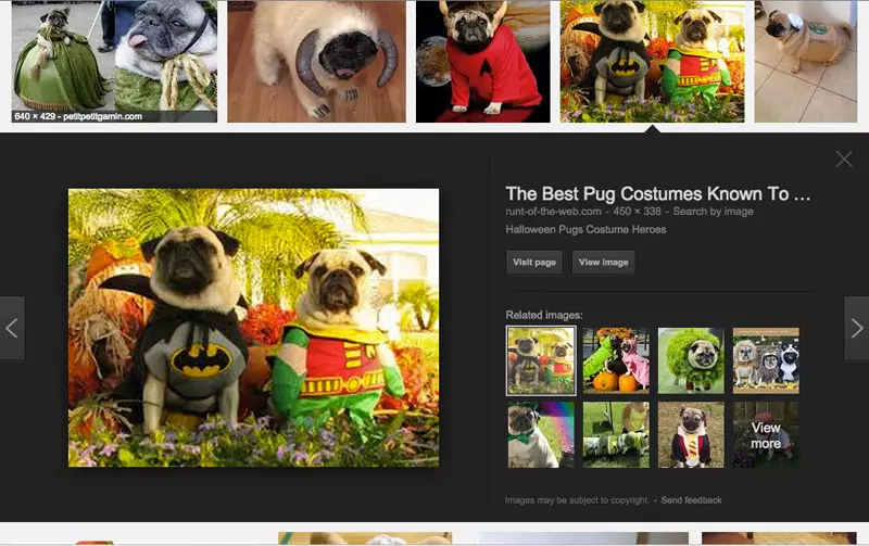
Recreating the Google Images Search Layout with CSS
Article Introduction:Key Takeaways
Recreating Google’s image search layout involves creating a basic HTML structure for images, styling them with CSS, and adding functionality with JavaScript.
The key CSS properties used in this process include display, grid-templat
2025-02-20
comment 0
685

What is the purpose of the element?
Article Introduction:The function is to display structured two-dimensional data, such as score sheets, timetables, etc.; it is not used for page layout. The correct way to use it includes: 1. wrap the entire table with it; 2. define the table header; 3. contain the main content; 4. represent a row; 5. or define a cell. Auxiliary tags include: add title; define column attributes; display the bottom summary information. Notes: Avoid complex structures, reduce the number of columns to improve the mobile experience, and use a responsive framework to optimize the display effect.
2025-07-01
comment 0
520
How to Create Vertical Tables in HTML?
Article Introduction:This article provides a solution for rendering HTML tables vertically, with rows displayed vertically and headers on the left. It utilizes CSS to modify the display properties of table rows and data to achieve this layout. To maintain the table's app
2024-10-24
comment 0
1083
Project-based CSS tutorial to build a portfolio
Article Introduction:To build a portfolio website using HTML and CSS, first plan a clear layout structure, then use mobile-first CSS for style design, then highlight project display, and finally add details to improve the overall experience. The specific steps include: 1. Use semantic HTML tags to build a basic structure containing headers, related, projects and contact parts; 2. Realize responsive design through flexbox or grid layout, media query and interactive effects; 3. Display projects in the form of cards and add animation effects; 4. Select color schemes, readable fonts, optimize links and SEO, and test website performance on different devices.
2025-07-01
comment 0
540

How do media queries enable responsive web design for different screen sizes and devices?
Article Introduction:Media query is a CSS feature that allows different styles to be applied according to the screen size, resolution, or direction of the device, thereby enabling responsive web design. Its core function is to optimize the layout display effect on different devices through condition judgment. For example, hide the menu to fit the mobile device when the screen width is less than 768px. It helps developers adjust layout structure, font size, element visibility and image switching without modifying HTML. Typical application scenarios include adaptation of mobile phones (480px), tablets (768px), and desktop devices (1024px or 1200px). It is recommended to adopt a mobile-first strategy and flexibly set breakpoints in combination with content needs. When using it, you need to pay attention to testing the actual screen width and reasonably matching min-widt
2025-06-17
comment 0
277
What are the basics of a CSS tutorial for absolute beginners?
Article Introduction:Beginners of CSS should first understand how they collaborate with HTML, master the CSS rules and structure, learn text and color styles, and understand the basics of layout. The article points out that HTML builds a web structure, and CSS is responsible for visual styles, connecting CSS and HTML through link tags; CSS rules are composed of selectors and declaration blocks; common attributes include color, font, alignment, etc.; each element consists of content, inner margins, borders, and outer margins to form a box model, and the display type can be controlled through block, inline, and inline-block. It is recommended to gradually explore the Flexbox or Grid layout starting from simple margin adjustment.
2025-06-30
comment 0
1017

How to debug HTML code in Google Chrome Developer Tools?
Article Introduction:The key to debugging HTML code is to master several core functions of ChromeDevTools. 1. Check the element structure: quickly locate the HTML position by right-clicking "Check", expand the node to view the nested structure, and double-click modifying content for temporary testing; 2. View and modify styles: View the applied CSS rules on the right side of the Elements panel, disable a certain style to observe the impact, or add a new style to test the effect; 3. Use the console to operate the DOM and execute JS, such as obtaining elements, modifying content, and testing whether the button event takes effect; 4. Responsive design debugging: Use the device toolbar to simulate different screen sizes, and comprehensively analyze layout problems in combination with the box model display and the Computed style panel.
2025-07-11
comment 0
1008

How to use HTML for building email newsletters?
Article Introduction:The key to building email communications using HTML is compatibility and structural simplification. 1. Use table layout to replace Flexbox or Grid to ensure stable display in major mailbox clients; 2. All CSS styles need to be written inline to avoid relying on external style sheets; 3. Images should be clearly set width and add alternative text, and the buttons should be simulated with linked table cells; 4. It must be tested on multiple mailbox clients and devices, and use tools such as Litmus or EmailonAcid to ensure consistent results. Following the above points can improve the compatibility and actual effect of HTML emails.
2025-07-12
comment 0
304

How to make your HTML responsive for mobile devices?
Article Introduction:The key to achieving friendly display of web pages on mobile phones is the coordination of HTML and CSS. The following points should be paid attention to: 1. Set the viewportmeta tag to ensure correct rendering on the mobile side; 2. Use media query to apply styles according to different screen sizes; 3. Use flex or grid to achieve elastic layout; 4. Control the image size to adapt to different containers; 5. Use developer tools, real machines or online tools to verify the effect during testing. Every step is crucial, and omissions can affect the overall responsive experience.
2025-07-05
comment 0
659

How to create a full-screen landing page with HTML and CSS?
Article Introduction:To create a full-screen landing page, you need to use HTML and CSS to combine viewport units and layout techniques. 1. Set the HTML structure and include viewport meta tags to adapt to mobile devices; 2. Use height:100vh to make the container occupy the full viewport height; 3. Use Flexbox to achieve vertical and horizontal centering of the content; 4. Use background-size:cover and background-position:center to ensure responsive display when adding background images; 5. Optimize the scrolling experience through scroll-behavior or JavaScript to ensure normal display and smooth interaction.
2025-07-07
comment 0
912
Clearing floats using various CSS methods
Article Introduction:Clearing floats is the key to solving CSS layout problems. When elements float, they will detach from the document stream, causing the container to collapse highly, affecting the layout effect. Common solutions are: 1. Use the clearfix method to insert content and clear floats through pseudo-elements, which is suitable for modern browsers without additional HTML elements; 2. Use overflow attributes (such as overflow:hidden or overflow:auto) to allow the container to contain floating elements, which is simple but may generate scroll bars; 3. Insert empty elements with clear:both style to force clear floats, which is effective but adds non-semantic tags; 4. Use modern layout technologies such as Flexbox or Grid to replace floating to make the layout more
2025-07-11
comment 0
766

