 <\/p>\n
 <\/p>\nNote #1:<\/strong> The content is not deciding the table width as it did while using ‘a(chǎn)uto’ property value according to the content. The ‘fixed’ value when used, the browser uses the width (if any) defined by the programmer. If not, the column’s widths are divided equally, no matter the length of the content in the cells. Below is one more example using table-layout: fixed property.\n\nNote #2:<\/strong> Since the width is set to 100%, the table spans across the container and divides the column’s width equally.\n
 <\/p>\n
 <\/p>\n
 <\/p>\n


The layout of your table in an HTML document can be set using the width property, and in-process restricting the width of the table, unchanged, making it fixed no matter how long the contents are inside the cells or what browser display settings are. OR we can use an HTML property known as table-layout.
The table-layout property is such that it helps define a set of instructions for the browser that the browser should use while laying out your table, and your table’s cells and columns.
So, in short, a table-layout property can be said to contain an algorithm that is given to the browser to follow, to layout your table. A table-layout property has various values to be set to, but it entirely depends on the user’s choice. The browsers do apply some rules automatically, defining how the cells and the columns will be laid out, if there is no use of the table-layout property. These rules are also applied when the table-layout property’s value is set to ‘a(chǎn)uto’.
Syntax :
Below is the simple syntax of the table-layout property.
ObjectName
{
table-layout:?auto|fixed|initial|inherit;
}
HTML Table Layout Values
The values to be used for table-layout property, as discussed above, entirely depends and vary according to a programmer’s choice of design and taste. The following are the values that can be used along with the table-layout property.
1. auto
‘a(chǎn)uto’ is the ‘by default’ value of the table-layout property. That is, even if the programmer does not define the table-layout property, the browsers use the ‘a(chǎn)uto’ constraints for defining a table and table’s cells and columns layouts. The width of the table and table’s cells depends on the content inside the cells, that is, the table’s width is adjusted according to the largest content in the cells, keeping is unbreakable.
Below is an example showing table-layout with ‘a(chǎn)uto’ as its value.
Example
This example shows a table with table width as 100% and the table-layout value is set to ‘a(chǎn)uto’.
Code:
<body> <h2>The <code>table-layout</code> property demo</h2> <table> <thead> <tr> <th>table-layout demo</th> <th>table-layout demo</th> <th>table-layout demo</th> <th>table-layout demo</th> </tr> </thead> <tbody> <tr> <td>This text is much bigger content for the demo. Adding more text here. More text being added?here.</td> <td>table-layout demo</td> <td>table-layout demo</td> <td>table-layout demo</td> </tr> <tr> <td>table-layout demo</td> <td>table-layout demo</td> <td>table-layout demo</td> <td>table-layout demo</td> </tr> </tbody> <tfoot> <tr> <td>table-layout demo</td> <td>table-layout demo</td> <td>table-layout demo</td> <td>table-layout demo</td> </tr> </tfoot> </table> </body>
Output:
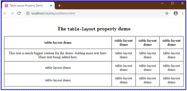
Note that, the table, has its width adjusted according to the content in the cells, the first column is being adjusted according to the large content in the second row-first cell. While other columns are divided equally since they contain the same worded content.
2. fixed
‘fixed’ value as the name suggests defines the table and its column’s width according to the predefined widths of the col elements (if any) and the width of the table. This property with value as ‘fixed’ can also be determined by the width of the very first row of cells of the table. The rest of the cell’s width does not matter or affect the table’s widths.
We will need to give the table’s width, some value instead of ‘a(chǎn)uto’ (a default value). In the below examples, the width is set to 100%.
Example #1
Using the same table created above, but setting table-layout to ‘fixed’ value and table width as 100%. CSS values as defined in the program are given below, HTML code is the same.
Code:
table {
width: 100%;
margin: 10px auto;
table-layout: fixed;
}
Output:

Example #2
This example shows how a fixed width of a cell matters and has its effects while using table-layout as fixed property.
Here we set the first cell’s width to 400px for demo purposes to exaggerate the difference of display. Now observe that the property value, ‘fixed’ has no effect on other cells since every other cell has the same content.

Example #3
Now observe the below example. This table is the same as above with a much larger content in one of the other cells and width set to 250px.
Note if the property was set to auto;
table {
width: 100%;
margin: 10px auto;
table-layout: auto;
}
Output:

But here, when the ‘fixed’ property is used, it toggles the table accordingly.
table {
width: 100%;
margin: 10px auto;
table-layout:?fixed;
}
- It does not touch the fixed width of the first cell.

- Divides the rest of the table equally, no matter the content.[Text Wrapping Break]
There are two more values that are Global Values.
- initial:?This value when used, sets the property to the default initial value.
- inherit:?You can also inherit a table layout design or property from a parent element.
Since when we use the ‘fixed’ table layout algorithm or layout method, your complete table gets rendered as soon as the browser receives the table’s first row and analyzes it. If the table is really large, users will only be able to see the table’s top row if the ‘fixed’ layout method is used which puts up a good effect on users, giving them the impression that the table is getting loaded faster.
The above is the detailed content of HTML Table Layout. For more information, please follow other related articles on the PHP Chinese website!

Hot AI Tools

Undress AI Tool
Undress images for free

Undresser.AI Undress
AI-powered app for creating realistic nude photos

AI Clothes Remover
Online AI tool for removing clothes from photos.

Clothoff.io
AI clothes remover

Video Face Swap
Swap faces in any video effortlessly with our completely free AI face swap tool!

Hot Article
Hot Tools

Notepad++7.3.1
Easy-to-use and free code editor

SublimeText3 Chinese version
Chinese version, very easy to use

Zend Studio 13.0.1
Powerful PHP integrated development environment

Dreamweaver CS6
Visual web development tools

SublimeText3 Mac version
God-level code editing software (SublimeText3)
Hot Topics


 What is the loading='lazy' one of the html attributes and how does it improve page performance?
Jul 01, 2025 am 01:33 AM
What is the loading='lazy' one of the html attributes and how does it improve page performance?
Jul 01, 2025 am 01:33 AM
loading="lazy" is an HTML attribute for and which enables the browser's native lazy loading function to improve page performance. 1. It delays loading non-first-screen resources, reduces initial loading time, saves bandwidth and server requests; 2. It is suitable for large amounts of pictures or embedded content in long pages; 3. It is not suitable for first-screen images, small icons, or lazy loading using JavaScript; 4. It is necessary to cooperate with optimization measures such as setting sizes and compressing files to avoid layout offsets and ensure compatibility. When using it, you should test the scrolling experience and weigh the user experience.
 What are best practices for writing valid and well-formed HTML code?
Jul 01, 2025 am 01:32 AM
What are best practices for writing valid and well-formed HTML code?
Jul 01, 2025 am 01:32 AM
When writing legal and neat HTML, you need to pay attention to clear structure, correct semantics and standardized format. 1. Use the correct document type declaration to ensure that the browser parses according to the HTML5 standard; 2. Keep the tag closed and reasonably nested to avoid forgetting closed or wrong nesting elements; 3. Use semantic tags such as, etc. to improve accessibility and SEO; 4. The attribute value is always wrapped in quotes, and single or double quotes are used uniformly. Boolean attributes only need to exist, and the class name should be meaningful and avoid redundant attributes.
 Declaring the correct HTML5 doctype for modern pages.
Jul 03, 2025 am 02:35 AM
Declaring the correct HTML5 doctype for modern pages.
Jul 03, 2025 am 02:35 AM
Doctype is a statement that tells the browser which HTML standard to use to parse the page. Modern web pages only need to be written at the beginning of the HTML file. Its function is to ensure that the browser renders the page in standard mode rather than weird mode, and must be located on the first line, with no spaces or comments in front of it; there is only one correct way to write it, and it is not recommended to use old versions or other variants; other such as charset, viewport, etc. should be placed in part.
 What are the essential HTML elements for structuring a webpage?
Jul 03, 2025 am 02:34 AM
What are the essential HTML elements for structuring a webpage?
Jul 03, 2025 am 02:34 AM
The web page structure needs to be supported by core HTML elements. 1. The overall structure of the page is composed of , , which is the root element, which stores meta information and displays the content; 2. The content organization relies on title (-), paragraph () and block tags (such as ,) to improve organizational structure and SEO; 3. Navigation is implemented through and implemented, commonly used organizations are linked and supplemented with aria-current attribute to enhance accessibility; 4. Form interaction involves , , and , to ensure the complete user input and submission functions. Proper use of these elements can improve page clarity, maintenance and search engine optimization.
 Handling reconnections and errors with HTML5 Server-Sent Events.
Jul 03, 2025 am 02:28 AM
Handling reconnections and errors with HTML5 Server-Sent Events.
Jul 03, 2025 am 02:28 AM
When using HTML5SSE, the methods to deal with reconnection and errors include: 1. Understand the default reconnection mechanism. EventSource retrys 3 seconds after the connection is interrupted by default. You can customize the interval through the retry field; 2. Listen to the error event to deal with connection failure or parsing errors, distinguish error types and execute corresponding logic, such as network problems relying on automatic reconnection, server errors manually delay reconnection, and authentication failure refresh token; 3. Actively control the reconnection logic, such as manually closing and rebuilding the connection, setting the maximum number of retry times, combining navigator.onLine to judge network status to optimize the retry strategy. These measures can improve application stability and user experience.
 What are the best practices for structuring an HTML5 document?
Jun 26, 2025 am 01:03 AM
What are the best practices for structuring an HTML5 document?
Jun 26, 2025 am 01:03 AM
To build standardized and clear HTML5 documents, the following best practices must be followed: 1. Use standard document type declarations; 2. Build a basic skeleton including three tags and pay attention to the character set, title and script location; 3. Use semantic tags such as , , to improve accessibility and SEO; 4. Reasonably nest the title levels to ensure that the structure is clear and there is only one per page. These steps help improve code quality, collaboration efficiency and user experience.
 How to define an abbreviation or acronym using the tag?
Jun 27, 2025 am 01:11 AM
How to define an abbreviation or acronym using the tag?
Jun 27, 2025 am 01:11 AM
Notes on using HTML tags: 1. It must be accompanied by title attribute to define the complete meaning of the abbreviation, such as HTML; 2. Use uniformly instead of discarded tags; 3. Use only when necessary, avoid nesting, and adjust the default style through CSS to improve accessibility and SEO effects.
 How does the spellcheck boolean in html attributes work on editable content?
Jun 27, 2025 am 01:44 AM
How does the spellcheck boolean in html attributes work on editable content?
Jun 27, 2025 am 01:44 AM
ThespellcheckattributeinHTMLcontrolswhetherbrowserscheckforspellingerrorsineditablecontent.Whensettotrue,browserstypicallyunderlinemisspelledwords,whilefalseusuallydisablessuchchecks,thoughbrowserbehaviorvaries:Chromefollowssettingsconsistently,Firef
