


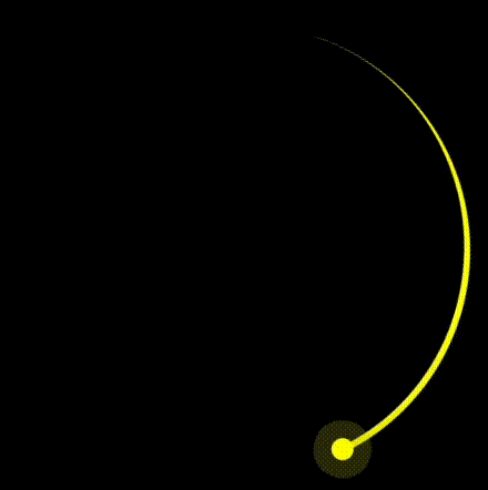
The overall effect is shown below:
Alright, let's walk through the steps to create this animation using CSS.
In this tutorial, we will guide you step-by-step on how to create a rotating trailing effect using CSS. We will achieve this by setting the width, height, border radius, background color, and multiple shadows for an element.
Here is the overall code and demo: https://codepen.io/venzil/pen/MWNVymY
Step 1: Setting Up the HTML Structure
First, we need to define the HTML hierarchy and structure.
The entire screen consists of three parts: first, the black background (.container), then the arc (.circle), and finally the small dot at the end of the arc (.dot).
The overall HTML structure is shown below.
<div class="container">
  <div class="circle">
    <div class="dot"></div>
  </div>
</div>
CSS Composition
1. Setting Background and Content Position
First, we set the black background of the page by directly modifying the
part of the HTML.body {
margin: 0;
height: 100vh;
display: flex;
align-items: center;
justify-content: center;
background-color: black;
}
By setting height: 100vh;, we ensure that the
background fills the entire viewport. Next, we use flexbox to horizontally and vertically center the content, placing it in the center of the page.Then, we set the size of the content.
.container {
background-color: transparent;
width: 200px;
height: 200px;
}
2. Drawing the Arc and Rotating It
The first step is to form an arc, which is actually a part of a circle. Therefore, we need to draw the entire circle first.
Start by drawing a square, and the size of this square is the content size we set earlier with a side length of 200px.
.container .circle {
border-color: yellow;
border-style: solid;
width: 100%;
height: 100%;
}

Next, we use border-radius to turn the square into a circle.
.container .circle {
border-color: yellow;
border-style: solid;
width: 100%;
height: 100%;
/* new */
border-radius: 50%;
}

Then, we just need to clip a part of the circle to make it look like an arc.
.container .circle {
border-style: solid;
width: 100%;
height: 100%;
border-radius: 50%;
/* new */
border-color: yellow transparent transparent yellow;
border-width: 3px 3px 0 0;
}

Now that the arc and the endpoint of the arc are generated, we just need to start rotating the arc.
Define a CSS animation keyframe (@keyframes) that specifies an animation sequence called animate.
In this animation sequence, the element will rotate one full turn (1turn is 360 degrees) from its initial state (usually from {}, but here it defaults to the current state).
@keyframes animate {
to {
transform: rotate(1turn);
}
}
Then, apply the animation keyframe to the .circle class.
<div class="container">
<div class="circle">
<div class="dot"></div>
</div>
</div>
- animation: This is the shorthand property for animations, which can combine multiple values such as animation name, duration, timing function, loop count, etc.
- animate: This is the name of the animation, corresponding to the @keyframes animate definition.
- 3s: The duration of the animation, meaning it takes 3 seconds to complete one cycle.
- linear: The timing function for the animation, indicating that it proceeds at a constant speed with no acceleration or deceleration.
- infinite: The loop count, meaning the animation will repeat indefinitely.
Once set, the animation effect will appear as shown below:

Next, we can add a small dot to the rotating head to enhance the animation effect.
body {
  margin: 0;
  height: 100vh;
  display: flex;
  align-items: center;
  justify-content: center;
  background-color: black;
}
This is the final result:

The above is the detailed content of How to Create a Rotating Trailing Effect with CSS. For more information, please follow other related articles on the PHP Chinese website!

Hot AI Tools

Undress AI Tool
Undress images for free

Undresser.AI Undress
AI-powered app for creating realistic nude photos

AI Clothes Remover
Online AI tool for removing clothes from photos.

Clothoff.io
AI clothes remover

Video Face Swap
Swap faces in any video effortlessly with our completely free AI face swap tool!

Hot Article
Hot Tools

Notepad++7.3.1
Easy-to-use and free code editor

SublimeText3 Chinese version
Chinese version, very easy to use

Zend Studio 13.0.1
Powerful PHP integrated development environment

Dreamweaver CS6
Visual web development tools

SublimeText3 Mac version
God-level code editing software (SublimeText3)
Hot Topics


 How can I include CSS only on some pages?
Jun 11, 2025 am 12:01 AM
How can I include CSS only on some pages?
Jun 11, 2025 am 12:01 AM
There are three ways to selectively include CSS on a specific page: 1. Inline CSS, suitable for pages that are not frequently accessed or require unique styles; 2. Load external CSS files using JavaScript conditions, suitable for situations where flexibility is required; 3. Containment on the server side, suitable for scenarios using server-side languages. This approach can optimize website performance and maintainability, but requires balance of modularity and performance.
 What is 'render-blocking CSS'?
Jun 24, 2025 am 12:42 AM
What is 'render-blocking CSS'?
Jun 24, 2025 am 12:42 AM
CSS blocks page rendering because browsers view inline and external CSS as key resources by default, especially with imported stylesheets, header large amounts of inline CSS, and unoptimized media query styles. 1. Extract critical CSS and embed it into HTML; 2. Delay loading non-critical CSS through JavaScript; 3. Use media attributes to optimize loading such as print styles; 4. Compress and merge CSS to reduce requests. It is recommended to use tools to extract key CSS, combine rel="preload" asynchronous loading, and use media delayed loading reasonably to avoid excessive splitting and complex script control.
 How to use Lotties in Figma
Jun 14, 2025 am 10:17 AM
How to use Lotties in Figma
Jun 14, 2025 am 10:17 AM
In the following tutorial, I will show you how to create Lottie animations in Figma. We'll use two colorful designs to exmplify how you can animate in Figma, and then I'll show you how to go from Figma to Lottie animations. All you need is a free Fig
 Breaking Boundaries: Building a Tangram Puzzle With (S)CSS
Jun 13, 2025 am 11:33 AM
Breaking Boundaries: Building a Tangram Puzzle With (S)CSS
Jun 13, 2025 am 11:33 AM
We put it to the test and it turns out Sass can replace JavaScript, at least when it comes to low-level logic and puzzle behavior. With nothing but maps, mixins, functions, and a whole lot of math, we managed to bring our Tangram puzzle to life, no J
 External vs. Internal CSS: What's the Best Approach?
Jun 20, 2025 am 12:45 AM
External vs. Internal CSS: What's the Best Approach?
Jun 20, 2025 am 12:45 AM
ThebestapproachforCSSdependsontheproject'sspecificneeds.Forlargerprojects,externalCSSisbetterduetomaintainabilityandreusability;forsmallerprojectsorsingle-pageapplications,internalCSSmightbemoresuitable.It'scrucialtobalanceprojectsize,performanceneed
 Does my CSS must be on lower case?
Jun 19, 2025 am 12:29 AM
Does my CSS must be on lower case?
Jun 19, 2025 am 12:29 AM
No,CSSdoesnothavetobeinlowercase.However,usinglowercaseisrecommendedfor:1)Consistencyandreadability,2)Avoidingerrorsinrelatedtechnologies,3)Potentialperformancebenefits,and4)Improvedcollaborationwithinteams.
 CSS Counters: A Step-by-Step Tutorial with Examples
Jun 12, 2025 am 10:31 AM
CSS Counters: A Step-by-Step Tutorial with Examples
Jun 12, 2025 am 10:31 AM
CSSCounters is a tool for creating automatic numbers. 1. Basic usage: define and operate counters through counter-reset and counter-increment, such as "SectionX." before h2. 2. Advanced usage: Use nested counters to create complex numbers, such as chapter and section numbers. 3. Notes: Ensure the counter is reset correctly, optimize performance, and simplify counter logic. 4. Best practice: clear naming, define counters in CSS, and use counter-increment and counter-reset reasonably.
 CSS Case Sensitivity: Understanding What Matters
Jun 20, 2025 am 12:09 AM
CSS Case Sensitivity: Understanding What Matters
Jun 20, 2025 am 12:09 AM
CSSismostlycase-insensitive,butURLsandfontfamilynamesarecase-sensitive.1)Propertiesandvalueslikecolor:red;arenotcase-sensitive.2)URLsmustmatchtheserver'scase,e.g.,/images/Logo.png.3)Fontfamilynameslike'OpenSans'mustbeexact.
