Found a total of 10000 related content

How to use media queries for responsive design
Article Introduction:Media query is the basic tool for responsive website design, enabling multi-device compatibility by switching styles based on device characteristics (such as screen width). Its basic syntax is @media media type and (condition){CSS rules}, for example, using @mediascreenand(max-width:767px) to adjust the style of the small screen. It is recommended to adopt a mobile priority strategy, first define the mobile phone style and then gradually adapt to a larger screen. Pay attention to when using: ① Select a general breakpoint instead of a specific device size; ② Set the viewport meta tag to ensure that the mobile terminal takes effect; ③ Avoid relying solely on browser zoom tests; ④ Only modify the styles that need to be adjusted in media queries. Mastering media queries helps build a responsive layout with clear structure and easy to maintain.
2025-06-30
comment 0
498
How to use CSS media queries for responsive design?
Article Introduction:CSSmediaqueries is the core tool for creating responsive websites, and it applies different styles according to device characteristics. The basic syntax is @media media type and (condition){style rules}, and the commonly used media type is screen. For example: @mediascreenand(max-width:768px) or combination conditions such as @mediascreenand(min-width:480px) and(max-width:768px). When setting breakpoints, it is recommended to adopt a mobile priority strategy and set key breakpoints based on typical device width: mobile phone vertical screen (max-width:480px), mobile phone horizontal screen/small tablet (481px-7
2025-07-17
comment 0
393

Implementing Effective Responsive Design with CSS Media Queries
Article Introduction:Media queries are CSS3 features that are used to dynamically adjust styles according to device attributes to ensure responsive design. It realizes different screen adaptation through @media rules combined with breakpoints (such as max-width, min-width). Common breakpoints include: 1. Mobile phone vertical screen: max-width: 480px; 2. Mobile phone horizontal screen or small tablet: 481px-768px; 3. Tablet and above: ≥769px. There are two ways to organize structure: centralized management by breakpoint is suitable for small projects, and decentralized management by components is conducive to maintenance of large projects. When using it, you should follow the mobile priority principle, adopt relative units, avoid excessive breakpoints, and consider high resolution and printing style adaptation, and cooperate with real machine testing to optimize the experience.
2025-07-05
comment 0
663

How to make an HTML page responsive
Article Introduction:The key to making responsive HTML pages is to combine CSS and media queries to automatically adapt to different screen sizes. 1. Use viewport meta tags to control mobile display: 2. Set breakpoints through media queries, such as mobile phone max-width:480px, tablet 481px-768px, desktop 769px or above; 3. Use Flexbox or Grid to achieve elastic layout; 4. Use max-width:100% to prevent overflow of containers; 5. Use mobile-first strategy to write basic styles for small screens first and then gradually enhance them. These steps can effectively improve page adaptability and avoid common problems.
2025-07-09
comment 0
142
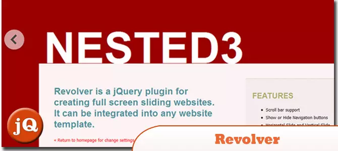
12 jQuery Fullscreen Plugins
Article Introduction:12 amazing jQuery full screen plug-ins to create a fascinating website!
Sometimes, full-screen websites are really cool! If a website looks plain, how long do you think visitors will stay? So, we have prepared some good stuff to help you: 12 jQuery full-screen plugins that give your website a stunning full-screen responsive effect! These plugins will add extraordinary visuals to your website. Ready?
Related recommendations:
100 jQuery picture/content slider plug-ins
30 jQuery responsive layout plug-ins
Revolver
A jQuery plugin for creating full-screen sliding websites. It can be integrated into any website template.
Source code
2025-02-25
comment 0
560

How to make a phone number clickable in HTML?
Article Introduction:In web development, using HTML tags and tel: protocol can realize the function of clicking and making calls. The specific method is to create links through format and it is recommended to keep the number concise or add country codes to support international numbers, such as tel: 11234567890. At the same time, the control phone link can be checked through CSS media to display only on the mobile terminal, improving the responsive design experience.
2025-07-09
comment 0
533
Implementing advanced layouts with CSS Grid techniques
Article Introduction:To use CSSGrid to implement advanced layouts, the key is to master its structural control and positioning methods. First, use grid-template-areas to build a semantic layout, such as the "head sidebar content area bottom" structure; second, through grid-column and grid-row, the element position can be accurately controlled, so that the card can span multiple columns or rows; then, combine minmax() and auto-fit to create a responsive grid, and automatically adjust the number of columns; finally, use cascade layout and z-index to control the element level to achieve a floating effect. These techniques can address complex and responsive web design needs.
2025-07-14
comment 0
650

how to rotate video in Premiere Pro
Article Introduction:There are three ways to rotate videos in PremierePro. 1. Use the "Motion" option in the "Effect Control" to accurately adjust the rotation angle, which is suitable for fine operation; 2. Use the "Create Sequence from Clip" function to automatically correct the vertical video direction of the mobile phone, saving time and effort; 3. Use "Crop" and "Zoom" to adjust the screen to fill the screen and avoid black edges to ensure complete output quality.
2025-07-04
comment 0
385

How to make your HTML responsive for mobile devices?
Article Introduction:The key to achieving friendly display of web pages on mobile phones is the coordination of HTML and CSS. The following points should be paid attention to: 1. Set the viewportmeta tag to ensure correct rendering on the mobile side; 2. Use media query to apply styles according to different screen sizes; 3. Use flex or grid to achieve elastic layout; 4. Control the image size to adapt to different containers; 5. Use developer tools, real machines or online tools to verify the effect during testing. Every step is crucial, and omissions can affect the overall responsive experience.
2025-07-05
comment 0
659

How to disable call forwarding on iPhone
Article Introduction:If your iPhone has a call forwarding set, you can unlock it by the following methods: 1. Turn on "Settings" → "Telephone" → "Call Forwarding" and turn off the switch; 2. If the option is not found, enter ##002# on the dial pad to clear all forwarding settings; 3. If it still cannot be resolved, contact the operator to confirm and release the remote settings. After operation, you can use another mobile phone to test whether it takes effect.
2025-07-15
comment 0
595

How to use computed properties with Composition API?
Article Introduction:In Vue3's Composition API, the computed function can be used to implement responsive computed properties; 1. The basic writing method is to pass a function that returns a value to create read-only properties, such as computed(()=>count.value*2); 2. When it is necessary to be readable and writable, you can use the object form with get and set, such as updating the firstName and lastName by assigning fullName.value; 3. There is no need to add .value when used in the template, Vue will automatically unpack; computed is more suitable for derived values, and watch is suitable for side effect operations. Reasonable choice can improve the simplicity of the code and the clarity of responsive logic.
2025-07-03
comment 0
600

What are meta tags in HTML and what are they for?
Article Introduction:Meta tags are text snippets in HTML that describe the content of web pages. They are not displayed on the page, but are used by browsers and search engines to correctly display and understand the website. They are located in the HTML document, and common types include: 1. Charsetmeta tags (set character encoding); 2. Viewportmeta tags (influence mobile device responsive design); 3. Descriptionmeta tags (influence page summary in search engine results); 4. OpenGraph/TwitterCards (control web page sharing display on social media). Meta tags have an auxiliary effect on SEO, such as improving click-through rate and improving mobile display, but some tags are like k
2025-07-14
comment 0
596

What is H5?
Article Introduction:H5, the abbreviation of HTML5, is a web development technology that supports mobile adaptation, touch interaction and multimedia functions. It is widely used in scenarios such as corporate publicity, marketing activities, data collection and education and training, such as fun tests, raffle pages, questionnaires and online courses. Compared with traditional web pages, H5 is more suitable for mobile browsing, and has responsive layout, offline caching and device information acquisition capabilities. The production of H5 can be quickly built through template platforms such as "Yiqixiu" and "Ruzhan", or developed by itself through HTML, CSS, JavaScript and other technologies, and attention should be paid to loading speed and compatibility testing.
2025-07-09
comment 0
305

How do media queries enable responsive web design for different screen sizes and devices?
Article Introduction:Media query is a CSS feature that allows different styles to be applied according to the screen size, resolution, or direction of the device, thereby enabling responsive web design. Its core function is to optimize the layout display effect on different devices through condition judgment. For example, hide the menu to fit the mobile device when the screen width is less than 768px. It helps developers adjust layout structure, font size, element visibility and image switching without modifying HTML. Typical application scenarios include adaptation of mobile phones (480px), tablets (768px), and desktop devices (1024px or 1200px). It is recommended to adopt a mobile-first strategy and flexibly set breakpoints in combination with content needs. When using it, you need to pay attention to testing the actual screen width and reasonably matching min-widt
2025-06-17
comment 0
277
What are common breakpoints for responsive design?
Article Introduction:The common breakpoint settings in responsive design are as follows: 1. The vertical screen of the mobile phone (0~767px) adopts a single-column layout, uses max-width:767px media query, optimizes touch operation and content priority; 2. The tablet and small-screen devices (768px~1023px) can introduce two-column layouts, uses min-width:768px and max-width:1023px media query, supports horizontal and vertical screen switching; 3. The desktop devices (1024px and above) use min-width:1024px media query, supports multi-column layout and high-definition image sources; 4. Other supplements include separate processing of mobile horizontal screens, large-screen optimization, focusing on viewport size rather than pixel ratio, and flexible use units. Really good
2025-06-29
comment 0
279

What is the purpose of the element?
Article Introduction:The function is to display structured two-dimensional data, such as score sheets, timetables, etc.; it is not used for page layout. The correct way to use it includes: 1. wrap the entire table with it; 2. define the table header; 3. contain the main content; 4. represent a row; 5. or define a cell. Auxiliary tags include: add title; define column attributes; display the bottom summary information. Notes: Avoid complex structures, reduce the number of columns to improve the mobile experience, and use a responsive framework to optimize the display effect.
2025-07-01
comment 0
520

How to create a simple single-page resume using HTML?
Article Introduction:To create an HTML single-page resume, the key is to have clear structure, concise style, responsive design and test release. 1. In terms of structure, use the header to place the name and contact information, section displays educational background, work experience, skills and other content in blocks, and footer can optionally place supplementary information; 2. Use appropriate font size (such as 16px), line height (1.5-1.6), color contrast and block spacing in the style to keep the page clean and easy to read; 3. Responsive design adjusts the font and layout through media query to ensure that the mobile phone display is good; 4. Finally, after local testing is correct, it can be uploaded to GitHubPages or Netlify for release, and the content is updated regularly to keep the latest.
2025-07-16
comment 0
219
Crafting a sticky footer layout using modern CSS
Article Introduction:To achieve a sticky footer, use Flexbox or Grid layout. 1. When using Flexbox, set the container to flex and set flex-direction:column to make the main content area expandable to fill the space; 2. When using Grid, define the row height through grid-template-rows to allow the main content to occupy the remaining space; 3. Pay attention to the mobile browser viewport problem and avoid directly using vh units or dynamically calculating the height to ensure the layout is displayed correctly. These methods can effectively achieve sticky footer effect.
2025-07-11
comment 0
378

Get 8Bitdo's Best Android Controller for Just $40 Today (20% Off)
Article Introduction:8Bitdo Ultimate Mobile Gamepad (Android)
Original price $50, current price $40, save $10! This handle is compatible with 100-170mm Android phones and features an Xbox-like key layout, Bluetooth connectivity, as well as a Hall-effect rocker and trigger keys.
Amazon's $40 8Bitdo is known for its retro-style wireless gamepads, but the company also makes some modern gamepads. This controller, designed for Android phones, is currently priced at $40, down 20% from the original price, making it a better choice for gaming on the go.
This handle surrounds your Android phone and retracts from 100-170mm, suitable for
2025-03-22
comment 0
1231

10 Best WordPress Themes You Should Be Using in 2022
Article Introduction:Ten best WordPress theme recommendations of 2022 to help you build your website to a higher level!
Choosing the right WordPress theme can significantly improve the efficiency and final effect of website construction. But "better" is not enough. Speed ??improvement does not mean performance improvement, and appearance improvements may not necessarily attract users. You need a theme that takes the design to a new level. This article recommends ten best WordPress themes of the year 2022 to help you stand out from many themes.
A quick look at the theme highlights:
BeTheme: With over 650 pre-built websites, it offers a wealth of design aids, elements and options, and supports mobile and Elementor to ensure website responsive and SEO
2025-02-10
comment 0
868
