

bootstrap responsive system framework
All resources on this site are contributed by netizens or reprinted by major download sites. Please check the integrity of the software yourself! All resources on this site are for learning reference only. Please do not use them for commercial purposes. Otherwise, you will be responsible for all consequences! If there is any infringement, please contact us to delete it. Contact information: admin@php.cn
Related Article
 How to do bootstrap responsive
07 Apr 2025
Bootstrap responsive design follows the mobile priority principle, using fluid layouts and grid systems to create websites that can be automatically adjusted to screen size. Specific steps include: importing Bootstrap, creating fluid containers, using grid systems, responsive utilities, and media queries. Following these principles makes it easy to create responsive websites that are suitable for a wide range of devices.
 How to Add Responsive Spacing Between Bootstrap Columns?
06 Dec 2024
How to Create Spacing Between Bootstrap ColumnsTo insert space between columns in Bootstrap, follow these steps:Question:How do you add a space...
 What are the key components of the Bootstrap framework (grid system, typography, components, utilities)?
14 Mar 2025
Article discusses key Bootstrap components: grid system, typography, components, and utilities. Focuses on enhancing responsive design and interactive UI creation.
 What is Bootstrap and why is it a popular CSS framework for responsive web design?
14 Mar 2025
Bootstrap is a popular CSS framework for responsive web design, offering ease of use, customization, and a mobile-first approach. It enhances user experience across devices with its adaptive components and consistent layouts.
 Responsive layout and bootstrap (example)_html/css_WEB-ITnose
24 Jun 2016
Responsive layout and bootstrap (example)
 How to Control Element Visibility in Bootstrap Responsive Layouts?
06 Nov 2024
Hiding Elements in Bootstrap Responsive LayoutsEnhance your Bootstrap design by optimizing content visibility across various screen sizes....
 How to Center Content in a Responsive Bootstrap Navbar?
30 Dec 2024
How to Center Content in a Responsive Bootstrap NavbarStruggling to align the content in your Bootstrap navbar? Here's a comprehensive solution...
 How to build a bootstrap framework
07 Apr 2025
To create a Bootstrap framework, follow these steps: Install Bootstrap via CDN or install a local copy. Create an HTML document and link Bootstrap CSS to the <head> section. Add Bootstrap JavaScript file to the <body> section. Use the Bootstrap component and customize the stylesheet to suit your needs.
 Bootstrap and React: Creating Responsive Web Applications
03 May 2025
How to create responsive web applications using Bootstrap and React? By combining Bootstrap's CSS framework and React's componentized architecture, modern, flexible and easy to maintain can be created. The specific steps include: 1) Importing the CSS file of Bootstrap and using its class to style React components; 2) Using React's componentization to manage state and logic; 3) Loading Bootstrap styles as needed to optimize performance; 4) Creating a dynamic interface using React's Hooks and Bootstrap's JavaScript components.


Hot Tools

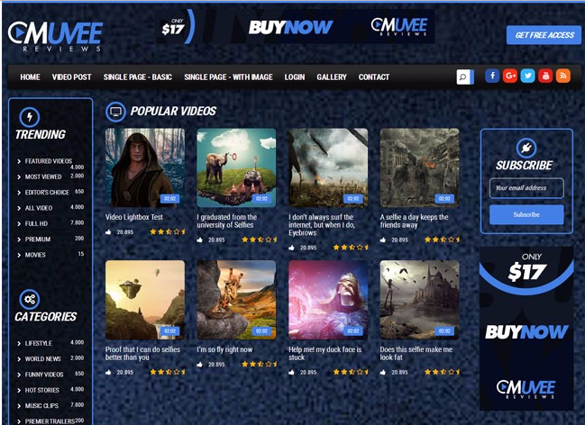
Bootstrap video website template
Bootstrap video website template is a movie website template download based on HTML5+CSS3.
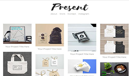
Fashion trend waterfall flow layout responsive website bootstrap template
Fashion trend waterfall flow layout responsive website bootstrap template free download
Literary and concise VI design company corporate responsive official website
Literary and simple VI design company corporate responsive official website template free download
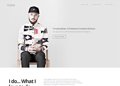
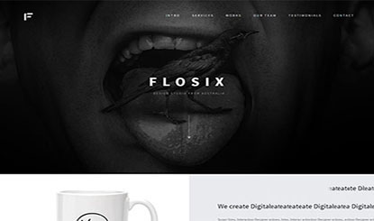
FLOIX Industrial Designer Studio official website template
FLOIX industrial designer studio official website template free download