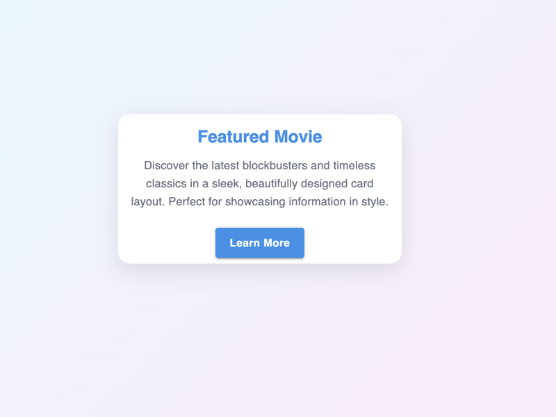
MUI Components: Your Complete Guide to Building Modern React UIs
Dec 29, 2024 pm 05:53 PMIntroduction to MUI Components
Material-UI (MUI) is a popular React UI library that simplifies building responsive and visually appealing web applications. With a rich set of prebuilt components like Autocomplete, Stack, Select, Card, Accordion, Stepper, and Badge, MUI saves development time while ensuring design consistency and responsiveness.
This guide explores how to use and customize these components effectively, with practical examples to help you seamlessly integrate them into your projects. Whether you’re a beginner or an experienced developer, this article will enhance your understanding of MUI and its capabilities.
Prerequisites
Before diving into MUI components, ensure your development environment is ready. This guide assumes you have a basic understanding of React and have already set up a React application. If you’re starting fresh or prefer a faster, lightweight setup, consider using Vite—a modern build tool for front-end projects. For detailed steps on setting up Vite with React, refer to our Beginner’s Guide to Using Vite with React.
Additionally, ensure you have Material-UI (MUI) installed in your project. You can do this by running the following command:
npm install @mui/material @emotion/react @emotion/styled
Once your React application is set up, the next step is integrating MUI
Setting Up the Theme
Material-UI (MUI) provides a powerful theming system that ensures design consistency across all components in your application. A custom theme controls colors, typography, spacing, and more, ensuring alignment with your brand.
Here’s how you can set up a basic theme in MUI:
Import Required Utilities: Use createTheme to define your custom theme and ThemeProvider to apply it globally.
Define Your Theme: Specify values for palette, typography, and other design properties.
Wrap Your Application: Use ThemeProvider to pass the theme to your entire app or specific sections.
Example: Creating and Applying a Custom Theme
import React from 'react';
import { createTheme, ThemeProvider } from '@mui/material/styles';
import { Button } from '@mui/material';

// Define a custom theme
const theme = createTheme({
  palette: {
    primary: {
      main: '#1976d2', // Primary color
    },
    secondary: {
      main: '#dc004e', // Secondary color
    },
  },
  typography: {
    fontFamily: 'Roboto, Arial, sans-serif',
  },
});

function App() {
  return (
    <ThemeProvider theme={theme}>
      <Button variant="contained" color="primary">
        Primary Button
      </Button>
      <Button variant="outlined" color="secondary">
        Secondary Button
      </Button>
    </ThemeProvider>
  );
}

export default App;
Customization Tips:
- Extending the Theme: Add additional design properties, such as spacing or breakpoints, to tailor the theme to your app’s needs.
- Using sx Prop: For quick customizations on a per-component basis, MUI's sx prop lets you override styles inline while still adhering to the theme.
By setting up a theme, you streamline the design process, maintain consistency, and simplify future updates to your app’s appearance.
Key MUI Components
MUI offers a variety of components to streamline UI development. Below, we explore some of the most commonly used components, their basic usage, and customization options.
1. MUI Autocomplete
Autocomplete enhances user inputs by providing suggestions from a predefined list.
Basic Example:
npm install @mui/material @emotion/react @emotion/styled
Customization:
- Enable free typing with freeSolo.
- Group options using groupBy.
- Fetch options dynamically for scalability.

2. MUI Stack
Stack arranges components in a one-dimensional layout (horizontal or vertical).
Basic Example:
import React from 'react';
import { createTheme, ThemeProvider } from '@mui/material/styles';
import { Button } from '@mui/material';

// Define a custom theme
const theme = createTheme({
  palette: {
    primary: {
      main: '#1976d2', // Primary color
    },
    secondary: {
      main: '#dc004e', // Secondary color
    },
  },
  typography: {
    fontFamily: 'Roboto, Arial, sans-serif',
  },
});

function App() {
  return (
    <ThemeProvider theme={theme}>
      <Button variant="contained" color="primary">
        Primary Button
      </Button>
      <Button variant="outlined" color="secondary">
        Secondary Button
      </Button>
    </ThemeProvider>
  );
}

export default App;
Customization:
- Change direction (row, column) and spacing.
- Use responsive props for dynamic layouts.

3. MUI Select
Select is a dropdown component for user choices.
Basic Example:
import React from 'react';
import { Autocomplete, TextField } from '@mui/material';

const options = ['Option 1', 'Option 2', 'Option 3'];

function AutocompleteExample() {
  return (
    <Autocomplete
      options={options}
      renderInput={(params) => <TextField {...params} label="Select an Option" />}
    />
  );
}

export default AutocompleteExample;
Customization:
- Add images using CardMedia.
- Include actions with CardActions.

5. MUI Accordion
Accordion is ideal for collapsible sections like FAQs.
Basic Example:
import React from 'react';
import { Stack, Button } from '@mui/material';

function StackExample() {
  return (
    <Stack direction="row" spacing={2}>
      <Button variant="contained">Button 1</Button>
      <Button variant="outlined">Button 2</Button>
    </Stack>
  );
}

export default StackExample;
Customization:
- Use expanded and onChange for controlled states.
- Remove padding with disableGutters.

6. MUI Stepper
Stepper creates workflows or multi-step processes.
Basic Example:
import React, { useState } from 'react';
import { Select, MenuItem, FormControl, InputLabel } from '@mui/material';

function SelectExample() {
  const [value, setValue] = useState('');

  const handleChange = (event) => setValue(event.target.value);

  return (
    <FormControl fullWidth>
      <InputLabel>


<p><strong>Customization:</strong>  </p>

<ul>
<li>Enable multiple selections with multiple.
</li>
<li>Render custom items with renderValue.</li>
</ul>

<p><img src="/static/imghw/default1.png"  data-src="https://img.php.cn/upload/article/000/000/000/173546599689834.jpg"  class="lazy" alt="MUI Components: Your Complete Guide to Building Modern React UIs" /></p>

<h4>


  <strong>4. MUI Card</strong>
</h4>

<p>Card displays structured content like text, images, and actions.</p>

<p><strong>Basic Example:</strong><br>
</p>

<pre class="brush:php;toolbar:false">import React from 'react';
import { Card, CardContent, Typography } from '@mui/material';

function CardExample() {
  return (
    <Card>
      <CardContent>
        <Typography variant="h5">Card Title</Typography>
        <Typography variant="body2">Card Content</Typography>
      </CardContent>
    </Card>
  );
}

export default CardExample;
Customization:
- Add icons to steps.
- Style active or completed steps with sx.

These key MUI components provide a foundation for creating intuitive and responsive interfaces. With customization options and practical examples, you can easily adapt them to fit your project’s needs.
Best Practices for Using MUI Components
To maximize the efficiency and maintainability of your projects with Material-UI (MUI), consider the following best practices:
1. Leverage the Theme for Consistency
- Why: Using MUI’s theming system ensures uniformity in design, reducing redundant styling and improving maintainability.
- How: Define a custom theme with createTheme and apply it globally with ThemeProvider. This ensures colors, typography, and spacing are consistent across all components.
- Example: Use the theme to adjust primary and secondary colors or typography styles across your application.
2. Use the sx Prop for Quick Customization
- Why: The sx prop provides a concise way to apply styles directly to components without external CSS files.
- How: Pass style objects or theme-based values to the sx prop for flexible, inline styling.
- Example:
npm install @mui/material @emotion/react @emotion/styled
3. Optimize Performance with Lazy Loading
- Why: Lazy loading reduces the initial load time by only rendering components when needed.
- How: Use React’s lazy() and Suspense to load MUI components on demand.
- Example:
import React from 'react';
import { createTheme, ThemeProvider } from '@mui/material/styles';
import { Button } from '@mui/material';

// Define a custom theme
const theme = createTheme({
  palette: {
    primary: {
      main: '#1976d2', // Primary color
    },
    secondary: {
      main: '#dc004e', // Secondary color
    },
  },
  typography: {
    fontFamily: 'Roboto, Arial, sans-serif',
  },
});

function App() {
  return (
    <ThemeProvider theme={theme}>
      <Button variant="contained" color="primary">
        Primary Button
      </Button>
      <Button variant="outlined" color="secondary">
        Secondary Button
      </Button>
    </ThemeProvider>
  );
}

export default App;
4. Prefer Responsive Design with Breakpoints
- Why: Responsive components ensure a seamless user experience across devices.
- How: Use the Grid system or sx prop with responsive values for breakpoints like xs, sm, md, etc.
- Example:
import React from 'react';
import { Autocomplete, TextField } from '@mui/material';

const options = ['Option 1', 'Option 2', 'Option 3'];

function AutocompleteExample() {
  return (
    <Autocomplete
      options={options}
      renderInput={(params) => <TextField {...params} label="Select an Option" />}
    />
  );
}

export default AutocompleteExample;
5. Avoid Overuse of Inline Styles
- Why: While the sx prop is powerful, excessive inline styles can clutter code and reduce readability.
- How: Use the makeStyles or styled API for reusable and organized styling.
6. Explore Component APIs for Advanced Features
- Why: MUI components offer extensive APIs that enable advanced customizations.
- How: Regularly consult the MUI documentation to leverage props like MenuProps in Select or renderInput in Autocomplete for specific needs.
7. Ensure Accessibility (A11y)
- Why: Accessibility ensures your application is usable for all users, including those with disabilities.
- How: Use semantic HTML and accessibility props like aria-* attributes. For example, add aria-expanded to Accordion or aria-labelledby for dialog elements.
8. Test Component Performance in Production
- Why: Certain MUI components can have a significant impact on performance, especially in large applications.
- How: Use tools like React DevTools and Lighthouse to analyze performance and identify bottlenecks.
9. Stay Updated with MUI Documentation
- Why: MUI is actively maintained, with new features and improvements being introduced regularly.
- How: Regularly check the official documentation for updates, best practices, and new releases.
10. Reuse Components for Scalability
- Why: Reusing components reduces development effort and ensures consistency.
- How: Abstract common UI patterns into reusable components (e.g., buttons, forms, cards) to avoid repetitive code.
By following these best practices, you can build efficient, scalable, and maintainable applications while harnessing the full potential of MUI.
Conclusion
Material-UI (MUI) components simplify the process of building responsive, modern web applications and powerful theming system. By following the best practices outlined in this guide, you can create consistent, accessible, and highly customizable interfaces that enhance user experience. Whether you’re a beginner or an experienced developer, MUI provides the tools to elevate your React projects efficiently.
The above is the detailed content of MUI Components: Your Complete Guide to Building Modern React UIs. For more information, please follow other related articles on the PHP Chinese website!

Hot AI Tools

Undress AI Tool
Undress images for free

Undresser.AI Undress
AI-powered app for creating realistic nude photos

AI Clothes Remover
Online AI tool for removing clothes from photos.

Clothoff.io
AI clothes remover

Video Face Swap
Swap faces in any video effortlessly with our completely free AI face swap tool!

Hot Article

Hot Tools

Notepad++7.3.1
Easy-to-use and free code editor

SublimeText3 Chinese version
Chinese version, very easy to use

Zend Studio 13.0.1
Powerful PHP integrated development environment

Dreamweaver CS6
Visual web development tools

SublimeText3 Mac version
God-level code editing software (SublimeText3)

Hot Topics
 Java vs. JavaScript: Clearing Up the Confusion
Jun 20, 2025 am 12:27 AM
Java and JavaScript are different programming languages, each suitable for different application scenarios. Java is used for large enterprise and mobile application development, while JavaScript is mainly used for web page development.
 Javascript Comments: short explanation
Jun 19, 2025 am 12:40 AM
JavaScriptcommentsareessentialformaintaining,reading,andguidingcodeexecution.1)Single-linecommentsareusedforquickexplanations.2)Multi-linecommentsexplaincomplexlogicorprovidedetaileddocumentation.3)Inlinecommentsclarifyspecificpartsofcode.Bestpractic
 How to work with dates and times in js?
Jul 01, 2025 am 01:27 AM
The following points should be noted when processing dates and time in JavaScript: 1. There are many ways to create Date objects. It is recommended to use ISO format strings to ensure compatibility; 2. Get and set time information can be obtained and set methods, and note that the month starts from 0; 3. Manually formatting dates requires strings, and third-party libraries can also be used; 4. It is recommended to use libraries that support time zones, such as Luxon. Mastering these key points can effectively avoid common mistakes.
 JavaScript vs. Java: A Comprehensive Comparison for Developers
Jun 20, 2025 am 12:21 AM
JavaScriptispreferredforwebdevelopment,whileJavaisbetterforlarge-scalebackendsystemsandAndroidapps.1)JavaScriptexcelsincreatinginteractivewebexperienceswithitsdynamicnatureandDOMmanipulation.2)Javaoffersstrongtypingandobject-orientedfeatures,idealfor
 Why should you place tags at the bottom of the ?
Jul 02, 2025 am 01:22 AM
PlacingtagsatthebottomofablogpostorwebpageservespracticalpurposesforSEO,userexperience,anddesign.1.IthelpswithSEObyallowingsearchenginestoaccesskeyword-relevanttagswithoutclutteringthemaincontent.2.Itimprovesuserexperiencebykeepingthefocusonthearticl
 JavaScript: Exploring Data Types for Efficient Coding
Jun 20, 2025 am 12:46 AM
JavaScripthassevenfundamentaldatatypes:number,string,boolean,undefined,null,object,andsymbol.1)Numbersuseadouble-precisionformat,usefulforwidevaluerangesbutbecautiouswithfloating-pointarithmetic.2)Stringsareimmutable,useefficientconcatenationmethodsf
 What is event bubbling and capturing in the DOM?
Jul 02, 2025 am 01:19 AM
Event capture and bubble are two stages of event propagation in DOM. Capture is from the top layer to the target element, and bubble is from the target element to the top layer. 1. Event capture is implemented by setting the useCapture parameter of addEventListener to true; 2. Event bubble is the default behavior, useCapture is set to false or omitted; 3. Event propagation can be used to prevent event propagation; 4. Event bubbling supports event delegation to improve dynamic content processing efficiency; 5. Capture can be used to intercept events in advance, such as logging or error processing. Understanding these two phases helps to accurately control the timing and how JavaScript responds to user operations.
 What's the Difference Between Java and JavaScript?
Jun 17, 2025 am 09:17 AM
Java and JavaScript are different programming languages. 1.Java is a statically typed and compiled language, suitable for enterprise applications and large systems. 2. JavaScript is a dynamic type and interpreted language, mainly used for web interaction and front-end development.


