


In Excel, using the timeline filter can display data by time period more efficiently, which is more convenient than using the filter button. The Timeline is a dynamic filtering option that allows you to quickly display data for a single date, month, quarter, or year.
Step 1: Convert data to pivot table
First, convert the original Excel data into a pivot table. Select any cell in the data table (formatted or not) and click PivotTable on the Insert tab of the ribbon.


Related: How to Create Pivot Tables in Microsoft Excel
Don't be intimidated by the pivot table! We will teach you basic skills that you can master in minutes.
In the dialog box, make sure the entire data range (including the title) is selected, and then select New Worksheet or Existing Worksheet as needed. I'm more inclined to create pivot tables in new worksheets, which makes it better to use its tools and features. After the selection is complete, click "OK".

In the Pivot Table Fields pane, select the fields you want the Pivot Table to display. In my case, I want to see the month and total sales, so I checked these two fields.

Excel automatically places the Month field in the Row box and the Total Sales field in the Value box.

In the above figure, Excel also adds year and quarter to the Row box of the PivotTable. This means that my pivot table has been compressed to the maximum unit of time (in this case, year), and I can click on the "" and "-" symbols to expand and shrink the pivot table to show and hide the data for the quarter and month.

However, since I want the Pivot Table to always display monthly data in full, I will click the down arrow next to each other in the Pivot Table Fields pane and then click Remove Field, leaving only the original Month field in the Row box. Removing these fields helps the timeline work more efficiently and can be re-added directly through the timeline once it is ready.

Now my pivot table shows each month and the corresponding total sales.

Step 2: Insert the timeline filter
The next step is to add a timeline associated with this data. Select any cell in the Pivot Table, open the Insert tab on the ribbon, and click Timeline.

In the dialog box that appears, select Month (or any time period in the table), and click OK.

Now adjust the position and size of the timeline in the spreadsheet so that it is neatly located near the Pivot Table. In my case, I inserted some extra rows above the table and moved the timeline to the top of the worksheet.

Step 3: Set the format of the timeline filter
In addition to adjusting the size and position of the timeline, you can also format it to make it more beautiful. After selecting the timeline, Excel adds the Timeline tab to the ribbon. There, you can select the labels to display by selecting and unchecking the options in the Show group, or selecting a different design in the Timeline Style group.

Although the preset timeline style cannot be reset, the style can be copied and formatted. To do this, right-click the selected style and click Copy.

Then, in the Modify Timeline Style dialog box, rename the new style in the Name field, and then click Format.

Now browse the Fonts, Borders, and Fill tabs to apply your own design to the timeline, click OK twice when you are done to close both dialogs and save the new style.

Finally, select the timeline and click on the new timeline style you just created to apply its formatting.
Going a step further: Add Pivot Chart
The last step to getting the most out of the timeline is to add a pivot chart that will be updated based on the time you selected in the timeline. Select any cell in the Pivot Table and click Pivot Chart on the Insert tab of the ribbon.

Now, in the Insert Chart dialog box, select the Chart Type in the menu on the left and the Chart in the selector area on the right. In my case, I chose a simple clustered column chart. Then, click OK.

Related: 10 Most Used Excel Charts and What to Do
Choose the best way to visualize your data.

Resize the chart position and size, double-click the chart title to change the name, and then click the ' ' button to select the label you want to display.

Related: How to Format Charts in Excel
Excel provides (too many) tools to make your charts more beautiful.

Now, select a time period on the timeline and view the Pivot Table and Pivot Chart to display the relevant data.
Another way to quickly filter data in an Excel table is to add an Excel Data Slicer, which is a series of buttons representing different categories or values ??in the data. The added benefit of using slicers is that they don't require you to convert your data into pivot tables - they work as well as regular Excel tables.
The above is the detailed content of How to Create a Timeline Filter in Excel. For more information, please follow other related articles on the PHP Chinese website!

Hot AI Tools

Undress AI Tool
Undress images for free

Undresser.AI Undress
AI-powered app for creating realistic nude photos

AI Clothes Remover
Online AI tool for removing clothes from photos.

Clothoff.io
AI clothes remover

Video Face Swap
Swap faces in any video effortlessly with our completely free AI face swap tool!

Hot Article
Hot Tools

Notepad++7.3.1
Easy-to-use and free code editor

SublimeText3 Chinese version
Chinese version, very easy to use

Zend Studio 13.0.1
Powerful PHP integrated development environment

Dreamweaver CS6
Visual web development tools

SublimeText3 Mac version
God-level code editing software (SublimeText3)
Hot Topics


 How to Use Parentheses, Square Brackets, and Curly Braces in Microsoft Excel
Jun 19, 2025 am 03:03 AM
How to Use Parentheses, Square Brackets, and Curly Braces in Microsoft Excel
Jun 19, 2025 am 03:03 AM
Quick Links Parentheses: Controlling the Order of Opera
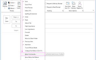 Outlook Quick Access Toolbar: customize, move, hide and show
Jun 18, 2025 am 11:01 AM
Outlook Quick Access Toolbar: customize, move, hide and show
Jun 18, 2025 am 11:01 AM
This guide will walk you through how to customize, move, hide, and show the Quick Access Toolbar, helping you shape your Outlook workspace to fit your daily routine and preferences. The Quick Access Toolbar in Microsoft Outlook is a usefu
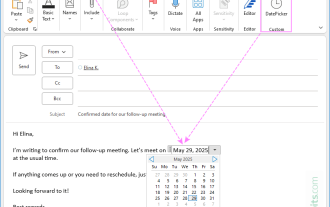 How to insert date picker in Outlook emails and templates
Jun 13, 2025 am 11:02 AM
How to insert date picker in Outlook emails and templates
Jun 13, 2025 am 11:02 AM
Want to insert dates quickly in Outlook? Whether you're composing a one-off email, meeting invite, or reusable template, this guide shows you how to add a clickable date picker that saves you time. Adding a calendar popup to Outlook email
 Prove Your Real-World Microsoft Excel Skills With the How-To Geek Test (Intermediate)
Jun 14, 2025 am 03:02 AM
Prove Your Real-World Microsoft Excel Skills With the How-To Geek Test (Intermediate)
Jun 14, 2025 am 03:02 AM
Whether you've secured a data-focused job promotion or recently picked up some new Microsoft Excel techniques, challenge yourself with the How-To Geek Intermediate Excel Test to evaluate your proficiency!This is the second in a three-part series. The
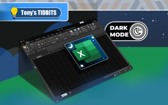 How to Switch to Dark Mode in Microsoft Excel
Jun 13, 2025 am 03:04 AM
How to Switch to Dark Mode in Microsoft Excel
Jun 13, 2025 am 03:04 AM
More and more users are enabling dark mode on their devices, particularly in apps like Excel that feature a lot of white elements. If your eyes are sensitive to bright screens, you spend long hours working in Excel, or you often work after dark, swit
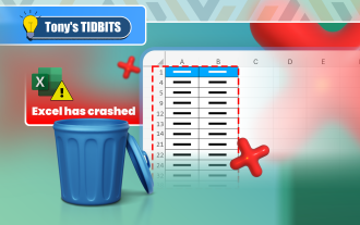 How to Delete Rows from a Filtered Range Without Crashing Excel
Jun 14, 2025 am 12:53 AM
How to Delete Rows from a Filtered Range Without Crashing Excel
Jun 14, 2025 am 12:53 AM
Quick LinksWhy Deleting Filtered Rows Crashes ExcelSort the Data First to Prevent Excel From CrashingRemoving rows from a large filtered range in Microsoft Excel can be time-consuming, cause the program to temporarily become unresponsive, or even lea
 Microsoft Excel Essential Skills Test
Jun 12, 2025 pm 12:01 PM
Microsoft Excel Essential Skills Test
Jun 12, 2025 pm 12:01 PM
Whether you've landed a job interview for a role that requires basic Microsoft Excel skills or you're looking to solve a real-world problem, take the How-To Geek Beginner Excel Test to verify that you understand the fundamentals of this popular sprea
 Google Sheets IMPORTRANGE: The Complete Guide
Jun 18, 2025 am 09:54 AM
Google Sheets IMPORTRANGE: The Complete Guide
Jun 18, 2025 am 09:54 AM
Ever played the "just one quick copy-paste" game with Google Sheets... and lost an hour of your life? What starts as a simple data transfer quickly snowballs into a nightmare when working with dynamic information. Those "quick fixes&qu
