

CSS3 responsive bootstrap template
All resources on this site are contributed by netizens or reprinted by major download sites. Please check the integrity of the software yourself! All resources on this site are for learning reference only. Please do not use them for commercial purposes. Otherwise, you will be responsible for all consequences! If there is any infringement, please contact us to delete it. Contact information: admin@php.cn
Related Article
 How to make a responsive website with HTML5 and CSS3?
13 Jul 2025
The key to making a responsive website lies in the reasonable cooperation between HTML5 and CSS3, and the core is to make web pages display well on different devices. 1. Use HTML5 semantic tags to build clear structures, such as, , etc., to make the code easier to read and facilitate search engine crawling; 2. Use CSS3 media query to achieve multi-device adaptation, and apply different rules by detecting screen width, such as setting breakpoints such as mobile phones and tablets; 3. Use elastic layout (Flexbox or Grid) to deal with alignment and arrangement issues, and ensure that the navigation bar and other content automatically adapt to the screen; 4. Set image adaptation, use max-width:100% and srcset attributes to ensure that the image does not destroy the layout and improve the loading effect. Mastering these four key points can achieve compatibility with multiple settings
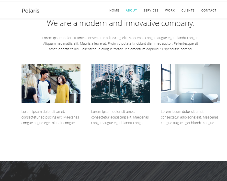
 React/Tailwind template with default responsive NavBar.
16 Nov 2024
I was just annoyed with excluding App.test.js and all those default files that I would not use in my React project, and also I've never found a good navbar other than that free version of navbar from Tailwind UI website, which is not the best navbar
 How to do bootstrap responsive
07 Apr 2025
Bootstrap responsive design follows the mobile priority principle, using fluid layouts and grid systems to create websites that can be automatically adjusted to screen size. Specific steps include: importing Bootstrap, creating fluid containers, using grid systems, responsive utilities, and media queries. Following these principles makes it easy to create responsive websites that are suitable for a wide range of devices.
 Bootstrap: Simplifying Responsive Web Development
09 May 2025
Bootstrap simplifies the development process mainly through its raster system, predefined components and JavaScript plug-ins. 1. The grid system allows for flexible layout, 2. Predefined components such as buttons and navigation bars simplify style design, 3. JavaScript plug-in enhances interactive functions and improves development efficiency.
 Bootstrap Grid System: Achieving Responsive Design
16 Jul 2025
Bootstrap'sGridSystemisessentialforcreatingresponsivedesignsacrossvariousdevices.Itusesa12-columnlayout,allowingflexiblecolumnarrangementsandresponsiveadjustmentswithprefixeslikexs,sm,md,lg,andxl.Youcannestrowsandcolumnsforcomplexlayouts,butbemindful
 Why does slider verification always fail when accessing a certain East mobile site in Chrome?
01 Apr 2025
About the reason why slider verification always fails when Chrome visits a certain East mobile site. When using Chrome browser to access a certain East mobile site, try to log in...
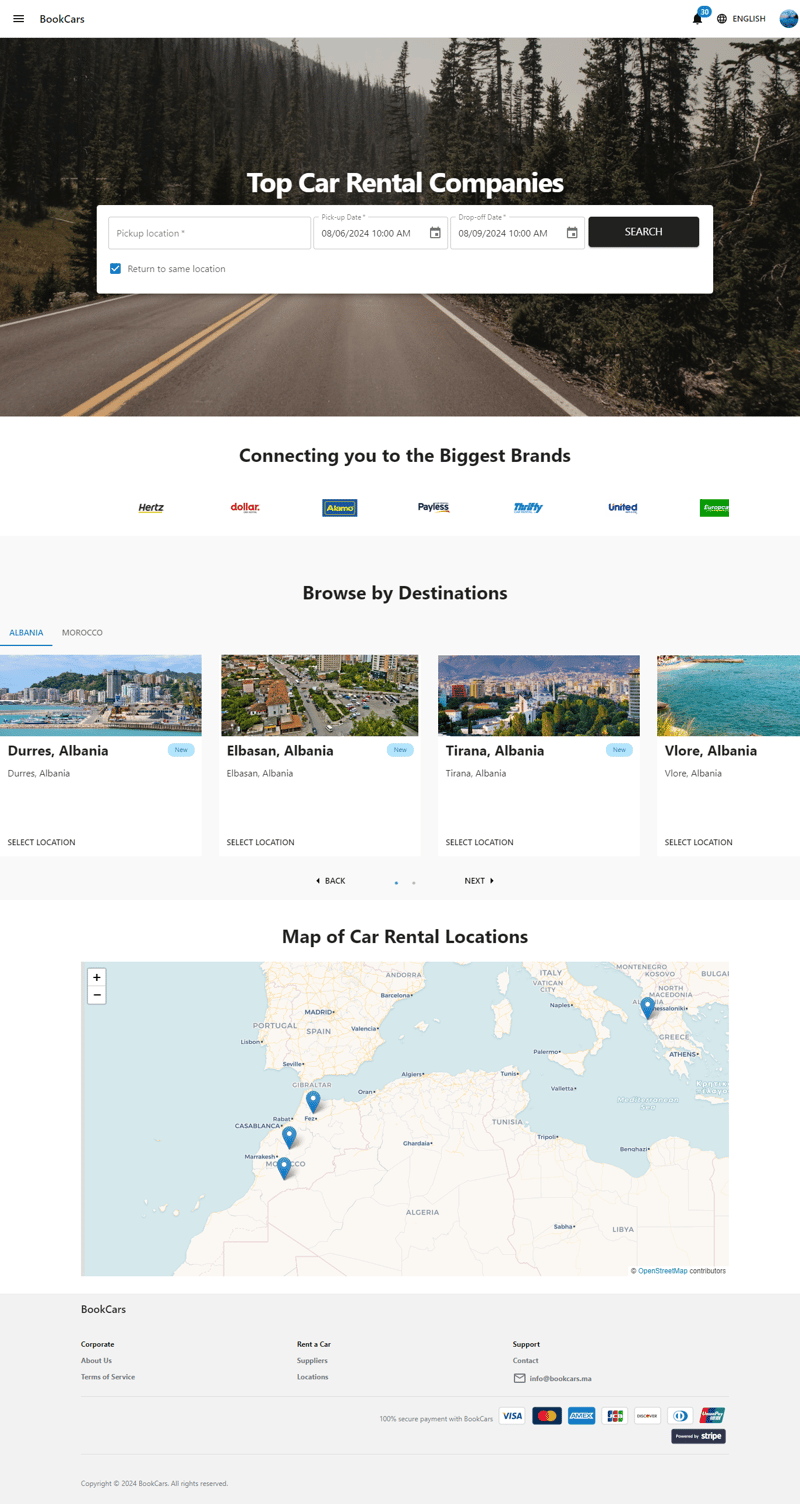 From Zero to Storefront: My Journey Building a Car Rental Website and Mobile App
26 Nov 2024
Contents Introduction Tech Stack Quick Overview API Frontend Mobile App Admin Dashboard Points of Interest Resources Source code: https://github.com/aelassas/bookcars Demo: https://bookcars.dynv6.net:3002 Introduction The idea e
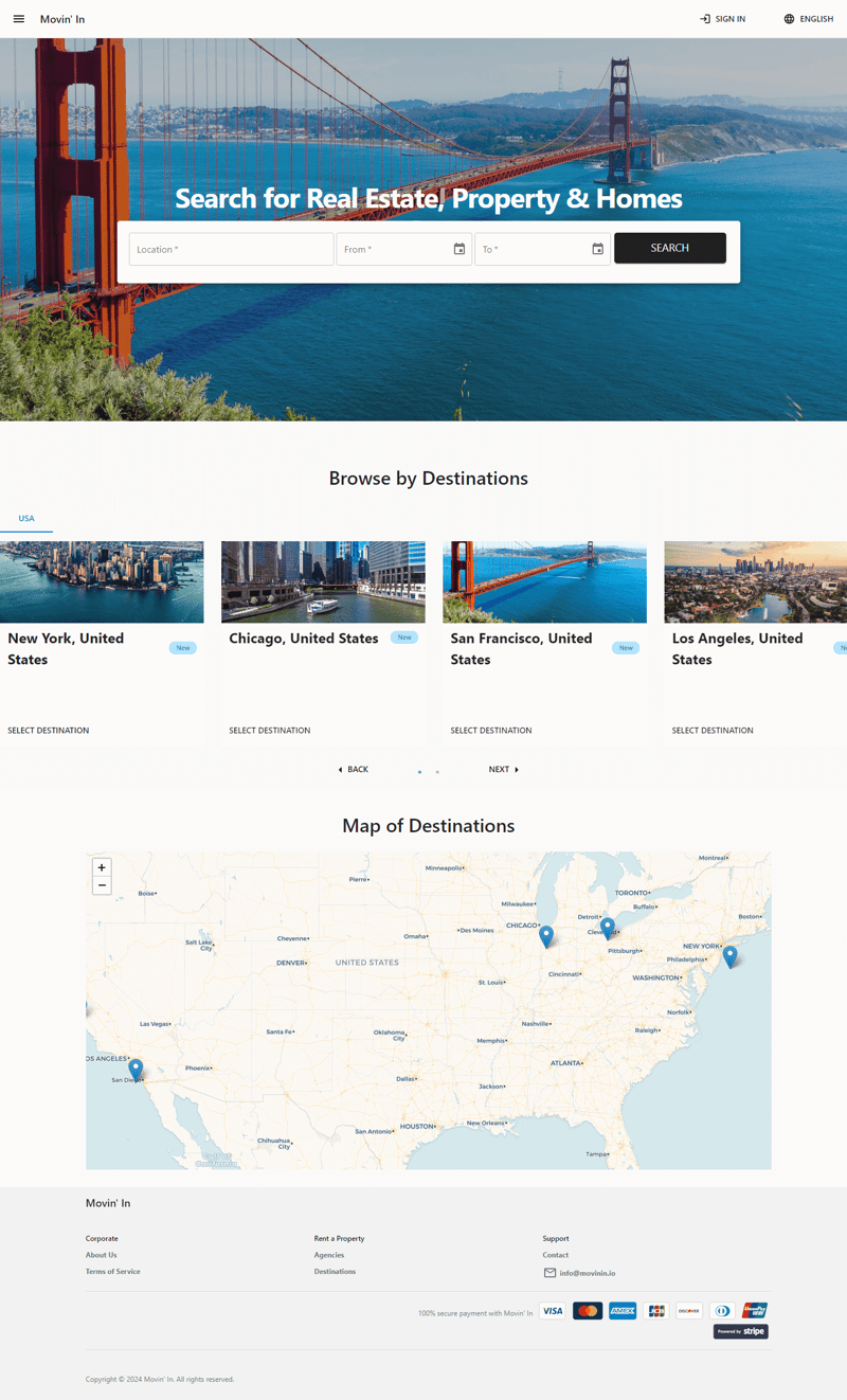
 From Zero to Storefront: My Journey Building a Property Rental Platform
11 Nov 2024
Contents Introduction Tech Stack Quick Overview API Frontend Mobile App Admin Dashboard Points of Interest Resources Source code: https://github.com/aelassas/movinin Demo: https://movinin.dynv6.net:3004 Introduction The idea eme
 From Zero to Hero: My Journey Building a Property Rental Website and Mobile App
11 Nov 2024
Contents Introduction Tech Stack Quick Overview Live demo API Frontend Mobile App Admin Dashboard Points of Interest Resources Source code: https://github.com/aelassas/movinin Demo: https://movinin.dynv6.net:3004 Introduction Th


Hot Tools

Blue mobile WAP travel website template
The blue mobile WAP travel website template is based on jquery-1.7.1.min.js and is suitable for making the mobile WAP side of the travel website, including two mobile template pages: homepage and personal center.

Quick online ordering system source code
Quick online ordering system

Beauty and skin care products mobile website html5 mobile website source code
Beauty and skin care products mobile website html5 mobile website touch screen website template

Imitate 58 listed company (PC site + mobile site) source code
2014 latest imitation 58 city listing source code multi-city classified information source code with wap Installation file: .Visit /install.php to install

Simple mobile WeChat mall ordering page template
Simple mobile WeChat shopping mall ordering page template, a complete set of templates, including multiple mobile template pages such as homepage, new shipping address, managed shipping address, product details, orders, etc.