


The key steps in creating a box chart in Excel include data preparation, inserting charts, and adjusting details. First, prepare numerical data, which can be used to compare different categories in a single column or multiple columns; secondly, after selecting the data area, click "Insert" - "Statistical Chart" - "Box Chart" to generate a chart; finally, right-click to adjust the details of color, axis range, outlier value display and calculation method to ensure that the chart is accurate and beautiful.

Creating a box chart (Box and Whisker Plot) is not difficult in Excel, especially since Excel 2016, Microsoft has built-in this chart type. You just need to prepare the data and select the right operation steps to quickly generate clear visual results.

Data preparation is key
Box charts are used to show the data distribution, so you need a set of numerical data. It can be a column of data or multiple sets of data in parallel to compare the distribution situations of different categories.
For example: If you want to compare the math scores of three classes, you should have three columns of data, each column represents a list of grades for a class.
A few suggestions:
- Try to be clean to avoid null values ??or text mixing
- There is no need to sort in advance, Excel will automatically handle it
- Try to be as close as possible to the effect more accurately
Steps to insert a box diagram
Inserting a box line chart in Excel is very direct. As long as the data is sorted out, you can complete it in a few steps.
The operation process is as follows:
- Select your data area (including title)
- Click "Insert" in the top menu bar
- Find the "Statistical Chart" category in the chart area
- Click "Box and Whisker"
At this time, Excel will automatically generate a box graph. By default, it displays medians, upper and lower quartiles, outliers, etc. for each dataset.
If you are using an old version of Excel (such as 2013 or earlier), you have to manually use the bar chart error bar to simulate the box chart. The process is more complicated, but not too difficult.
Chart details can be adjusted
The newly generated box chart may look a little simple, but you can personalize it by right-clicking on the chart element.
Common adjustments include:
- Modify colors and styles to make the chart more beautiful
- Adjust the axis range and highlight key areas
- Show or hide outliers
- Change the display method, such as whether to display the mean mark
Double-click the box part in the chart to open the "Set Data Series Format" panel, where you can choose different calculation methods, such as whether the average value is included, or modify the calculation method of the quartile (including median interpolation, etc.).
Basically that's it. The whole process is not complicated, but details of data format and chart options are easily overlooked. Just pay attention to these points and you can easily make professional box charts in Excel.
The above is the detailed content of how to create a box and whisker plot in excel. For more information, please follow other related articles on the PHP Chinese website!

Hot AI Tools

Undress AI Tool
Undress images for free

Undresser.AI Undress
AI-powered app for creating realistic nude photos

AI Clothes Remover
Online AI tool for removing clothes from photos.

Clothoff.io
AI clothes remover

Video Face Swap
Swap faces in any video effortlessly with our completely free AI face swap tool!

Hot Article
Hot Tools

Notepad++7.3.1
Easy-to-use and free code editor

SublimeText3 Chinese version
Chinese version, very easy to use

Zend Studio 13.0.1
Powerful PHP integrated development environment

Dreamweaver CS6
Visual web development tools

SublimeText3 Mac version
God-level code editing software (SublimeText3)
Hot Topics


 How to Use Parentheses, Square Brackets, and Curly Braces in Microsoft Excel
Jun 19, 2025 am 03:03 AM
How to Use Parentheses, Square Brackets, and Curly Braces in Microsoft Excel
Jun 19, 2025 am 03:03 AM
Quick Links Parentheses: Controlling the Order of Opera
 Outlook Quick Access Toolbar: customize, move, hide and show
Jun 18, 2025 am 11:01 AM
Outlook Quick Access Toolbar: customize, move, hide and show
Jun 18, 2025 am 11:01 AM
This guide will walk you through how to customize, move, hide, and show the Quick Access Toolbar, helping you shape your Outlook workspace to fit your daily routine and preferences. The Quick Access Toolbar in Microsoft Outlook is a usefu
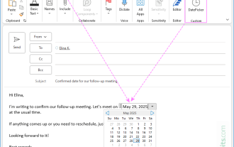 How to insert date picker in Outlook emails and templates
Jun 13, 2025 am 11:02 AM
How to insert date picker in Outlook emails and templates
Jun 13, 2025 am 11:02 AM
Want to insert dates quickly in Outlook? Whether you're composing a one-off email, meeting invite, or reusable template, this guide shows you how to add a clickable date picker that saves you time. Adding a calendar popup to Outlook email
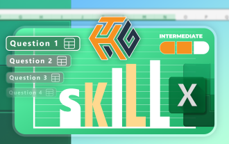 Prove Your Real-World Microsoft Excel Skills With the How-To Geek Test (Intermediate)
Jun 14, 2025 am 03:02 AM
Prove Your Real-World Microsoft Excel Skills With the How-To Geek Test (Intermediate)
Jun 14, 2025 am 03:02 AM
Whether you've secured a data-focused job promotion or recently picked up some new Microsoft Excel techniques, challenge yourself with the How-To Geek Intermediate Excel Test to evaluate your proficiency!This is the second in a three-part series. The
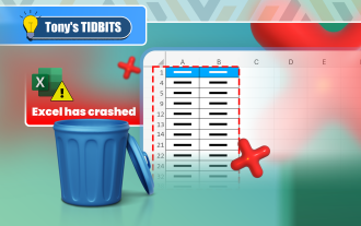 How to Delete Rows from a Filtered Range Without Crashing Excel
Jun 14, 2025 am 12:53 AM
How to Delete Rows from a Filtered Range Without Crashing Excel
Jun 14, 2025 am 12:53 AM
Quick LinksWhy Deleting Filtered Rows Crashes ExcelSort the Data First to Prevent Excel From CrashingRemoving rows from a large filtered range in Microsoft Excel can be time-consuming, cause the program to temporarily become unresponsive, or even lea
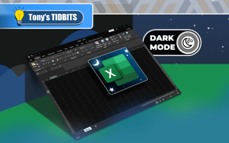 How to Switch to Dark Mode in Microsoft Excel
Jun 13, 2025 am 03:04 AM
How to Switch to Dark Mode in Microsoft Excel
Jun 13, 2025 am 03:04 AM
More and more users are enabling dark mode on their devices, particularly in apps like Excel that feature a lot of white elements. If your eyes are sensitive to bright screens, you spend long hours working in Excel, or you often work after dark, swit
 Microsoft Excel Essential Skills Test
Jun 12, 2025 pm 12:01 PM
Microsoft Excel Essential Skills Test
Jun 12, 2025 pm 12:01 PM
Whether you've landed a job interview for a role that requires basic Microsoft Excel skills or you're looking to solve a real-world problem, take the How-To Geek Beginner Excel Test to verify that you understand the fundamentals of this popular sprea
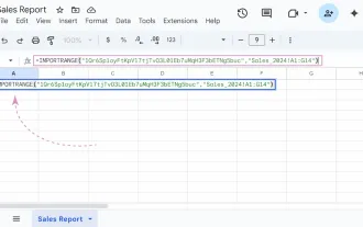 Google Sheets IMPORTRANGE: The Complete Guide
Jun 18, 2025 am 09:54 AM
Google Sheets IMPORTRANGE: The Complete Guide
Jun 18, 2025 am 09:54 AM
Ever played the "just one quick copy-paste" game with Google Sheets... and lost an hour of your life? What starts as a simple data transfer quickly snowballs into a nightmare when working with dynamic information. Those "quick fixes&qu
